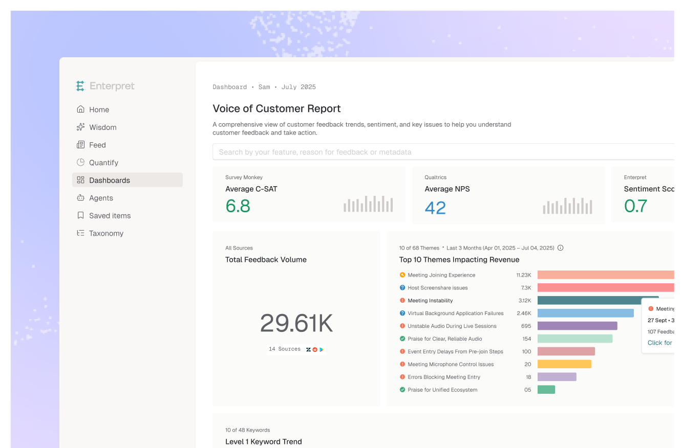
In an effort to increase Enterpret's visual inclusivity, we are adding 15 new charting colors. We aim to make the platform more accessible for users with different visual abilities, like color blindness.
What has changed in this update?
The previous palette on our dashboard had excessive color overlap. This made differentiating between them a very strenuous experience. Since color is an integral part of understanding feedback data on Enterpret, we reconsidered our approach to prevent important aspects of the product from getting ignored.
With this update, we have widened the range of colors across the product, optimized chart views to remove any repeat colors, and improved contrast between the colors in our palette for easier differentiation.
The Process
We conducted exhaustive research with the express purpose of making Enterpret as accessible for different visions as possible. The new variety of shades and tints had to work well with dark backgrounds and provide a high level of differentiation. Multiple colors were proposed. We used Stark to check contrast ratios with its background, ensuring that the colors pass at least AA.
We constantly strive to make Enterpret more accessible and inclusive for our users. This update introduces an expanded, more flexible color palette that works well together and makes the overall user experience on the platform more pleasant.