🌟 Vertically expand charts on Dashboards for clearer viewing
Dive deeper into your data with our latest feature - Vertical Expansion on Trend Charts! Now, simply drag a chart vertically, and watch it seamlessly expand to fill the available space. This intuitive interaction offers a clearer, more detailed view of your trends, making data analysis both easier and more effective.
🔄 Rename Durations on Quantify Charts for better context
Following the release of our filter renaming feature, we're excited to enable the ability to rename durations in Quantify charts. Tailor your charts to your needs and preferences, ensuring that every aspect of your data presentation makes sense for your team.
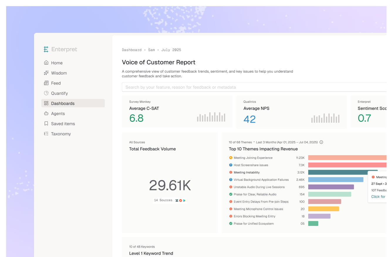
🔗 Identify co-occurrences with new icons on Dashboards and Quantify Charts
We're taking co-occurrence analysis to the next level! Co-occurring predictions are now prominently highlighted on Dashboard quantify charts with a new link icon. Plus, they're also integrated into Quantify charts. This expansion beyond Quantify tables means more comprehensive insights, right where you need them.