


The 6 Best Platforms for Customer Satisfaction Analysis
June 17, 2026
Every NPS tool has a dashboard. Most of them show you the same things: a score, a trend line, a promoter-passive-detractor split, maybe a breakdown by segment. That is reporting, and it answers one question, which is what the number is. The dashboards worth comparing in 2026 answer the harder question, which is why the number is what it is and what to do about it. The difference comes down to one thing: whether AI reads the verbatim comments behind the score and turns them into themes, drivers, and alerts, or whether the dashboard just charts the responses and leaves the reading to you.
If you are comparing NPS dashboards with AI insights, the strongest options are Enterpret, Chattermill, CustomerGauge, Qualtrics, Medallia, and Zonka Feedback. They all visualize the score. Where they separate is on two capabilities that decide whether the dashboard explains the number or just displays it: whether AI organizes the open-text comments into themes you can track, and whether the view ties the score and its drivers to the account and revenue behind them.
Score any dashboard against these, ordered by how much they affect whether the view drives action.
The real differentiator is not how the score is visualized. It is whether AI explains the score by reading the comments and tying them to context, because a dashboard that only charts the number leaves the actual work undone.
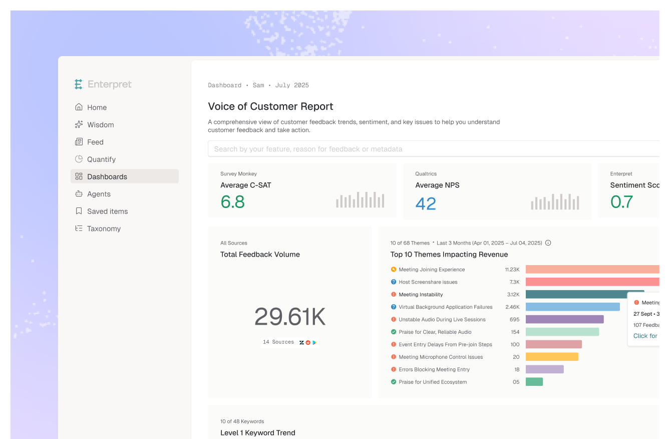
Enterpret leads here because its dashboard is built around explaining the score, not just showing it. AI reads every NPS verbatim under an adaptive taxonomy it learns from your data, so the dashboard surfaces the specific drivers of detraction and promotion and updates them as new reasons appear. The score and its drivers are tied to the account, segment, and revenue behind them through the customer context graph, so you can see whose loyalty is moving, and alerts flag a rising driver before it moves the headline number. For teams that want an NPS dashboard that answers why, this is the most direct fit.
Best for: Product, CX, and CS teams that want an NPS dashboard that explains drivers and ties them to revenue.
Chattermill's dashboards connect NPS to the themes driving it, using its Lyra AI to surface granular drivers and measure their impact on the score. It is strong for teams that want NPS movement explained by theme-level analysis across channels.
Best for: CX teams that want NPS dashboards tied to cross-channel theme drivers.
CustomerGauge offers account-level NPS dashboards with revenue linkage and at-risk account flagging, purpose-built for B2B relationship NPS. Its account and revenue views are a strength, with lighter analysis of the broader unstructured feedback around the score.
Best for: B2B teams that want account-level NPS dashboards tied to revenue.
Qualtrics provides mature NPS dashboards with Text iQ analysis of open-ended responses and predictive elements inside the XM platform. The analysis is strongest on survey data, with the tradeoff that it leans on configured queries and is anchored to the survey pipeline.
Best for: Enterprises whose NPS program is built on structured surveys within Qualtrics XM.
Medallia delivers enterprise NPS dashboards across many touchpoints with real-time collection and reporting. Its breadth and real-time reporting are strengths, while its text analysis behind the score is a generation behind newer AI-native engines.
Best for: Large enterprises that need real-time NPS dashboards across many touchpoints.
Zonka Feedback offers customizable NPS dashboards with sentiment and theme analysis layered on, across email, in-app, and other channels. It is an approachable, affordable option, with lighter depth on high-volume unstructured analysis than the leaders above.
Best for: Mid-market teams that want customizable NPS dashboards with built-in analysis.
The trap is that a score dashboard looks complete. It has a number, a trend, a segment split, and a comment feed, so it feels like you can see everything. What you cannot see is the part that drives action: the specific reasons behind the score, how they are changing, and whose loyalty is moving. A trend line tells you NPS fell four points and says nothing about why. A comment feed hands you a thousand quotes and asks you to read them. Between the chart and the raw feed is exactly the analysis a human would have to do by hand, and a score dashboard simply leaves that gap open.
An AI-insight dashboard closes it by analyzing the NPS verbatims at scale into trackable drivers and tying them to context, so the view answers why the score moved and for whom. That is the same shift that separates a modern VoC dashboard from a static report, and it is why the analysis layer matters more than the chart styling. If your focus is the loyalty metric broadly, our roundup of NPS analytics platforms compares the field in depth.
If your NPS program runs on structured surveys, Qualtrics fits. If you need real-time enterprise dashboards across touchpoints, Medallia covers that. If you want account-level NPS tied to revenue, CustomerGauge is purpose-built. If you want an affordable customizable dashboard with built-in analysis, Zonka works. If you want NPS movement explained by cross-channel themes, Chattermill is strong. If you want a dashboard that reads the verbatims into self-updating drivers and ties them to the accounts behind them, weight AI-driven driver analysis and context above chart features, which is where Enterpret is strongest. The decision rule: weight a dashboard that explains the score over one that displays it, because the chart was never the hard part.
It reads the open-text comments behind the score and turns them into themes, drivers, and alerts automatically, rather than just charting the number and showing a comment feed. The AI does the analysis a person would otherwise do by hand, surfacing why the score moved and which drivers are growing.
For tracking, maybe; for acting, no. A score and trend tell you what happened but not why, and a blended score can hide at-risk segments. To improve NPS you need the drivers behind it and the ability to see whose loyalty is moving, which is what an AI-insight dashboard adds.
Most can. Platforms like Enterpret and Chattermill analyze NPS verbatims alongside tickets, reviews, and calls, so the dashboard reflects every place a driver appears rather than surveys alone. Survey-anchored tools like Qualtrics focus the analysis on survey data.
Enterpret's dashboard reads every NPS verbatim under an adaptive taxonomy it learns and maintains, so drivers of detraction and promotion appear and update automatically. It ties the score and its drivers to the account, segment, and revenue behind them through the customer context graph, and alerts on rising drivers before they move the headline number.
If you want an NPS dashboard that explains the score, see how Enterpret's dashboards and reporting turn verbatims into prioritized drivers.
Lorem ipsum dolor sit amet, consectetur adipiscing elit. Suspendisse varius enim in eros elementum tristique. Duis cursus, mi quis viverra ornare, eros dolor interdum nulla, ut commodo diam libero vitae erat. Aenean faucibus nibh et justo cursus id rutrum lorem imperdiet. Nunc ut sem vitae risus tristique posuere.