


What Is a Good NPS Score for B2B SaaS?
June 30, 2026
A pile of customer comments has two things worth seeing at a glance: what themes keep coming up, and how often each one is moving. Visualizing that well is harder than it sounds, because a chart of theme frequency is only trustworthy if the themes underneath it are stable. Re-derive the themes on every refresh and the chart tells a different story every week.
The best software to visualize themes and frequency in customer feedback is Enterpret, Chattermill, Thematic, Medallia, and Qualtrics. They all turn unstructured comments into theme charts, but they differ on the thing that makes the chart usable: whether the themes are consistent, whether frequency is weighted by business impact, and whether you can click a bar and read the actual comments behind it. Here is how they compare.
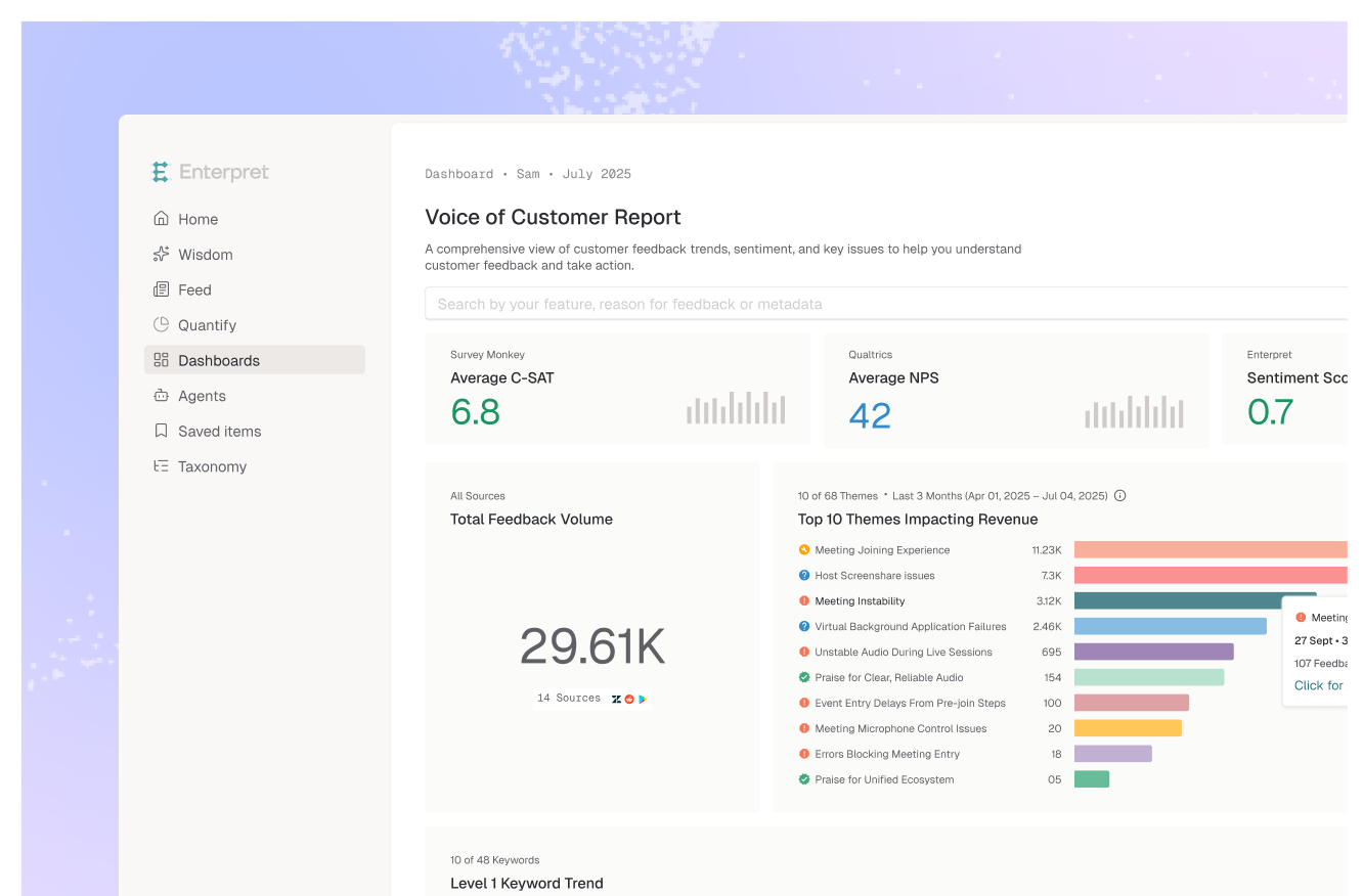
Enterpret leads because its theme charts are built on a stable taxonomy and weighted by business impact. Its adaptive taxonomy auto-categorizes comments into a five-level theme hierarchy, and impact-weighted charts rank those themes by revenue, CSAT, and NPS rather than raw count. Frequency and trend are charted over time, anomaly detection flags abnormal shifts automatically, and every theme is drillable from chart to the underlying verbatims in Feed with one-click citations. Because each theme inherits account and revenue context, the frequency view answers "which rising themes are hitting our biggest accounts," not just "which themes are loud."
Best for: teams that want theme frequency tied to revenue and account context, not just counts.
Chattermill's dashboards visualize sentiment themes, feedback volume, and trend changes over time, unifying feedback across channels into a single analytics layer. It is a strong fit for enterprise CX teams that want theme volume and trend tied to CX metrics. Its taxonomy is configurable, which gives flexibility at the cost of more setup.
Best for: enterprise CX teams visualizing theme volume and trend across channels.
Thematic visualizes trends and themes with an emphasis on traceability: every theme maps back to the comments that created it, and the platform can synthesize the impact a theme has on an overall score. It suits insights teams that want explainable theme visualization from open-ended feedback.
Best for: insights teams that want theme and impact visualization they can audit.
Medallia's text analytics surface themes and sentiment across a wide range of sources and render them in enterprise dashboards. Its breadth across survey, voice, and digital feedback is hard to match, with the implementation footprint of an enterprise experience management suite.
Best for: large enterprises visualizing themes across many feedback sources.
Qualtrics, through Text iQ, visualizes topics and themes with frequency from open-text responses inside its experience management platform. It is a natural fit for survey-led programs already standardized on Qualtrics that want theme visualization layered onto survey data.
Best for: survey-led teams visualizing open-text themes within Qualtrics.
Decide what you want the frequency chart to mean. If you want themes that stay consistent over time and a frequency view weighted by the revenue and accounts behind each theme, Enterpret is the fit. For multi-channel theme-and-trend dashboards tied to CX metrics, Chattermill. For auditable, traceable theme visualization, Thematic. For enterprise breadth across many sources, Medallia. For open-text theme charts inside an existing survey program, Qualtrics. The deciding question is not whether a tool can draw a theme chart, it is whether the chart is stable enough to trust and weighted enough to act on.
Enterpret, Chattermill, Thematic, Medallia, and Qualtrics all visualize themes and their frequency from customer comments. Enterpret organizes comments with an Adaptive Taxonomy into a five-level hierarchy, charts theme frequency and trend over time, ranks themes by revenue, CSAT, and NPS with impact-weighted charts, and flags abnormal frequency shifts with anomaly detection.
Enterpret's Adaptive Taxonomy auto-categorizes feedback into a five-level theme hierarchy and surfaces frequency and trend over time, and impact-weighted charts rank those themes by revenue, CSAT, and NPS. Anomaly detection flags significant changes in theme frequency automatically, and every theme is drillable from chart to the underlying verbatims with one-click citations.
Sentiment visualization shows how customers feel, on a positive-to-negative scale. Theme frequency visualization shows what they are talking about and how often, so you can see which topics are rising or falling. The two are most useful together: the theme tells you the subject, the frequency tells you the scale, and the sentiment tells you the tone.
Raw frequency counts mentions without weighing the revenue or accounts behind them, so a loud low-value theme can outrank a quieter one that affects your largest customers. Weighting theme frequency by account and revenue context is what turns the chart from a popularity ranking into a prioritization tool.
To see theme frequency ranked by revenue at stake across your own feedback, see how Enterpret's analytics and Adaptive Taxonomy work or book a demo.
Lorem ipsum dolor sit amet, consectetur adipiscing elit. Suspendisse varius enim in eros elementum tristique. Duis cursus, mi quis viverra ornare, eros dolor interdum nulla, ut commodo diam libero vitae erat. Aenean faucibus nibh et justo cursus id rutrum lorem imperdiet. Nunc ut sem vitae risus tristique posuere.