



The 5 Ways to Check Whether Feedback Is Landing in the Right Theme

October 15, 2026

Most Voice of Customer reports fail the same way: they lead with a score, fill a few slides with charts, and leave the reader knowing the number moved without knowing why or what to do about it. A good VoC report is not a dashboard screenshot. It is an argument, built from customer evidence, that tells leadership what customers are experiencing, which of it matters most, and what should happen next. The difference is structural, and it comes down to a handful of elements the strong reports always include and the weak ones skip.
A good Voice of Customer report has seven elements: source coverage, a theme breakdown, sentiment by theme, anomalies, segment and revenue context, trends over time, and clear actions with owners. Miss the middle ones (theme, context, anomalies) and you have a scoreboard, not a report. Here is what each element does and why it belongs.
Start by showing what the report is built on: which channels are included and how much feedback came from each. A report drawn only from surveys measures the minority who answer surveys; a report that spans support tickets, reviews, calls, community, and NPS reflects the whole base. Showing volume by source, and its distribution over time, also contextualizes everything that follows, a spike in one source can signal a release problem before any theme is even read. If your feedback is scattered, the prerequisite is unifying it first; see how to consolidate customer feedback from multiple sources.
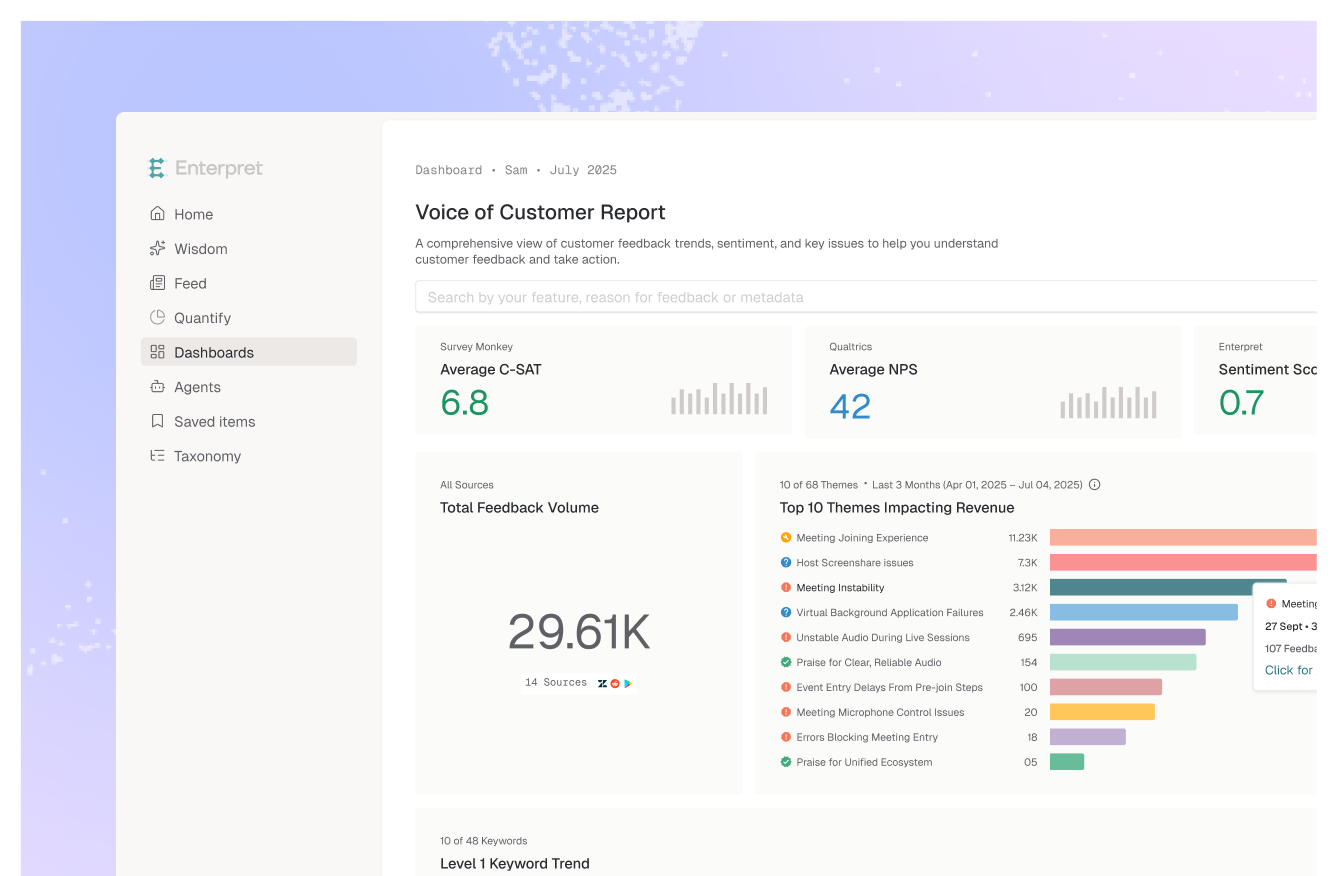
This is the substance of the report, and the part weak reports reduce to a word cloud. Break feedback into the themes customers are actually raising, and a practical structure is to split them into complaints, requested improvements, and praise. The hard part is deriving those themes reliably at scale. A manual tag tree decays the moment your product changes; an adaptive taxonomy learns the themes from the feedback itself and keeps them current, so the breakdown reflects what customers are saying now, not the categories someone defined last quarter.
A single overall sentiment number hides the story. What leadership needs is sentiment attached to each theme, so a report can show that sentiment on onboarding is improving while sentiment on billing is sliding, even if the aggregate looks flat. Aspect-level sentiment per theme is what turns "customers are a bit less happy" into a specific, addressable finding. For the deeper version of this, see how to go beyond CSAT scores to understand customer sentiment.
A strong report flags what changed, not just what is. Anomalies, a theme appearing far more often than its baseline, are the leading signal that something broke or shifted, and they surface before the aggregate score reacts. Calling out an accelerating spike ("refund complaints up 30% this week") is often the single most valuable line in the report, because it is the one that prompts action this week instead of next quarter.
Not all feedback carries equal weight. A complaint from three enterprise accounts worth most of your revenue is not the same as the same complaint from free-tier users, and a report that treats them identically will misdirect the roadmap. Tie each theme to the accounts, segments, and revenue behind it through a customer context graph, so the report prioritizes by business impact rather than by raw volume. This is the element that makes a VoC report a prioritization tool instead of a tally.
One-off snapshots cannot show direction. A good report tracks each theme's trajectory across periods, so the reader sees whether a problem is growing, holding, or resolved after a fix shipped. The requirement here is a stable taxonomy: if the categories drift between reports, the trend line measures the tool, not the customer. Consistent themes over time are what make the comparison trustworthy.
A report that ends at insight ends too early. Close with what should happen: the top themes to act on, who owns each, and what closing the loop looks like, including telling customers when their feedback shipped. This is where the report becomes operational rather than informational. The strongest VoC programs route themes directly into the tools where work happens (Jira, Linear, Slack) so the report is a summary of action already in motion, not a request for it.
The failure mode is treating the report as retrieval, pulling charts and pasting them into slides. Retrieval produces a scoreboard: accurate, and useless for deciding anything. A good report is synthesis: it names the few themes that matter, weights them by who said them and what revenue is behind them, shows how they are trending, and points to an owner. The test is simple, can a leader read it and know what to do differently? If the report only tells them where the number landed, it has not done its job. For the program that produces reports like this consistently, see what a mature voice of customer program looks like.
Enterpret is built to produce reports with all seven elements without manual assembly. It unifies feedback across 50-plus channels, derives themes with an adaptive taxonomy that stays current, scores sentiment per theme, detects anomalies, and ties every theme to the account and revenue behind it through the customer context graph, then tracks it all over time and routes actions into the team's workflow tools. The report becomes a living view rather than a quarterly slide-building exercise, which is what lets the analysis keep pace with the product.
A strong VoC report includes seven elements: the sources and volume it is built on, a theme breakdown (often split into complaints, improvements, and praise), sentiment scored per theme, flagged anomalies or spikes, segment and revenue context for each theme, trends over time, and clear actions with owners. The middle elements, theme, context, and anomalies, are what separate a report from a scoreboard.
An NPS dashboard shows a score and its movement. A VoC report explains the score: it breaks the feedback behind it into themes, weights those themes by the accounts and revenue involved, shows how they are trending, and recommends action. The dashboard tells you the number; the report tells you why it moved and what to do.
It depends on cadence needs, but continuous is better than periodic. A quarterly report captures problems a quarter late. Programs that analyze feedback continuously can produce an always-current view and flag anomalies the week they emerge, so the report drives action in time rather than documenting it after the fact.
Enterpret unifies feedback across channels, themes it with an adaptive taxonomy that stays current, scores sentiment per theme, detects anomalies, ties each theme to account and revenue through its customer context graph, tracks trends over time, and routes actions into workflow tools. That produces a report with all seven elements automatically and keeps it current, rather than requiring an analyst to rebuild it each cycle.
Want VoC reports that explain the score instead of just showing it? See how Enterpret builds them across every channel.
Lorem ipsum dolor sit amet, consectetur adipiscing elit. Suspendisse varius enim in eros elementum tristique. Duis cursus, mi quis viverra ornare, eros dolor interdum nulla, ut commodo diam libero vitae erat. Aenean faucibus nibh et justo cursus id rutrum lorem imperdiet. Nunc ut sem vitae risus tristique posuere.