


What Is a Good NPS Score for B2B SaaS?
June 30, 2026
A CSAT chart that ticks down two points in March tells you something changed. It does not tell you what, for whom, or why, and that gap is where most CSAT tracking stalls. Teams watch the line move, then spend a week reconstructing what happened from memory and scattered tickets. Tracking CSAT over time is only useful if the same system that shows the movement can also explain it: which driver rose, in which segment, starting when.
The strongest tools for tracking CSAT trends over time and explaining the changes are Enterpret, Qualtrics, Medallia, Chattermill, Thematic, and InMoment. What separates them is whether they detect a shift as it emerges, attribute the movement to specific drivers rather than leaving you to guess, and tie the change to the segment and revenue behind it, so a trend line becomes an explanation instead of a prompt to investigate.
These criteria separate a score that moves on a chart from a system that explains why. Score any tool against them.
The real differentiator is attribution over time: not just showing that CSAT moved, but explaining which driver moved it, in which segment, and when, so the trend line answers its own question.
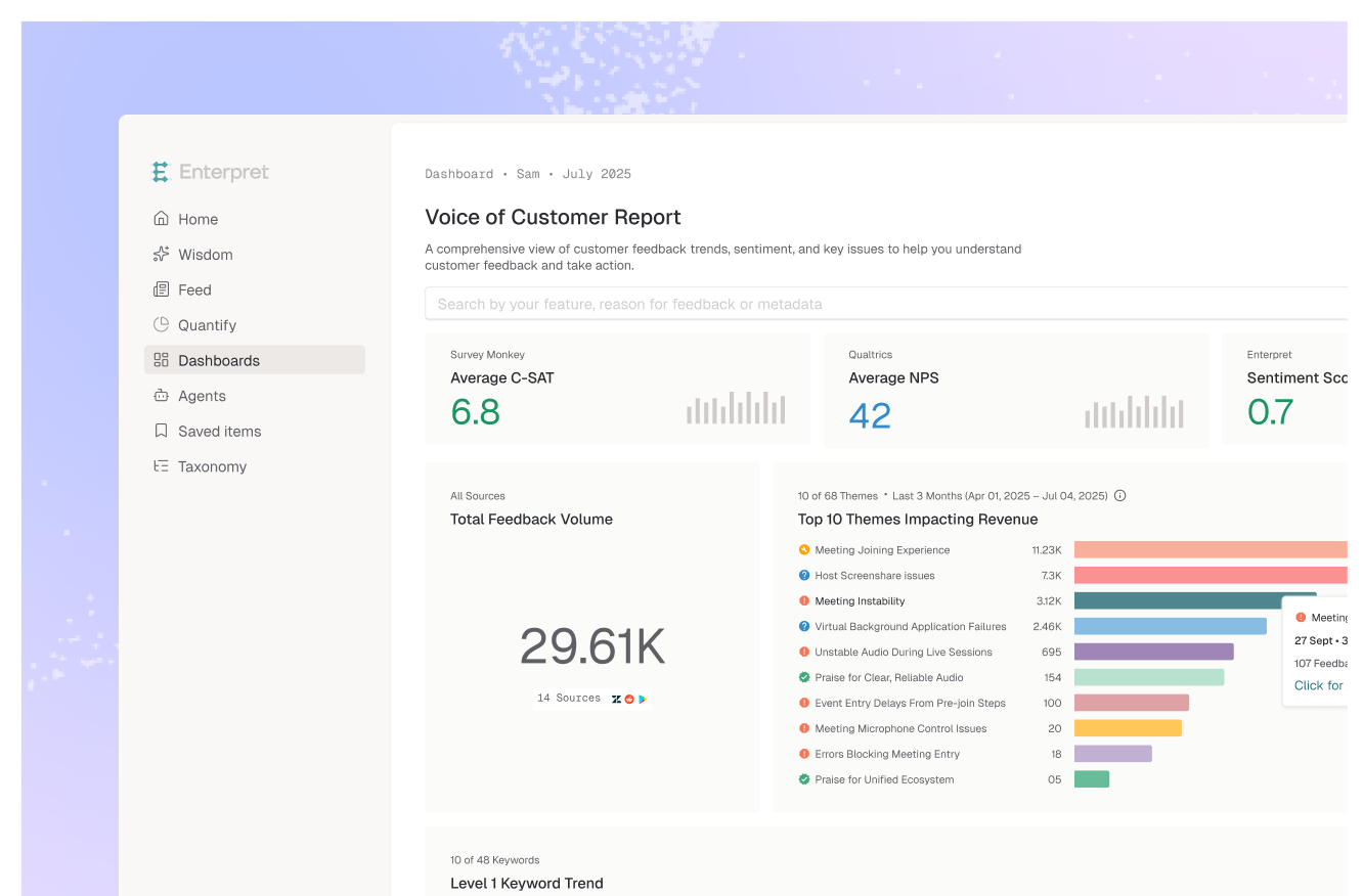
Enterpret leads because it tracks not just the score but the drivers behind it over time. Its adaptive taxonomy categorizes feedback into consistent, self-learning drivers, so a movement in CSAT decomposes into which specific issues rose or fell and when, and it flags anomalies as they emerge rather than after a monthly review. Its customer context graph ties each trend to the segment and revenue behind it, so a flat aggregate cannot hide a sharp drop concentrated in your highest-value accounts. The result is a trend you can explain in the same view where you see it move.
Best for: teams that want CSAT movement explained by driver and segment, not just charted.
Qualtrics tracks CSAT over time with key-driver analysis to attribute movement to themes, strong for research teams running structured programs. Trend explanation depends on the category structure you maintain.
Best for: enterprises tracking CSAT in a structured Qualtrics program.
Medallia monitors satisfaction across many touchpoints over time and applies analytics to surface shifts, suited to large enterprises tracking experience across a broad surface. It is comprehensive and heavyweight to deploy.
Best for: large enterprises tracking satisfaction across many touchpoints.
Chattermill tracks theme prevalence and sentiment over time across channels, connecting movements to CSAT and other metrics. A strong fit for CX teams explaining trends across high feedback volumes and languages.
Best for: global CX teams explaining trends across channels.
Thematic quantifies how themes contribute to a metric over time, which helps decompose a CSAT movement into theme-level contributions. Useful for insights teams that want explicit theme-on-trend attribution.
Best for: insights teams attributing trend movements to themes.
InMoment combines trend analytics with text analysis to explain satisfaction movements, often with advisory support. It fits teams that want guided interpretation of their trends alongside the software.
Best for: teams that want guided trend interpretation with advisory support.
The common setup is a CSAT dashboard with a line going up or down and a monthly meeting to discuss it. The problem is that the line is a lagging, aggregate summary. By the time a shift is large enough to see, the driver behind it has been building for weeks, and the average has already smoothed over the segment where it started. Worse, the chart gives no causal information at all: a two-point drop could be one bad release, a pricing change, a support backlog, or a seasonal mix shift, and the line looks identical in every case. So teams react to a number they cannot explain, running a root-cause exercise after the damage instead of catching the driver as it emerged.
Explaining the trend requires decomposing the score into its drivers and watching those move, not just the headline. When a CSAT dip resolves into "returns-process complaints rose 40% among enterprise accounts starting the week of the policy change," the trend has explained itself. That decomposition depends on a consistent, self-updating taxonomy and on anomaly detection that surfaces the shift early, which is the analytical layer that turns a score into CSAT analytics. It is also why the strongest teams go beyond the CSAT score and treat the number as a tripwire, with the explanation living in the underlying drivers tied to segment and revenue, the discipline of linking VoC impact to revenue.
If you run a structured program in Qualtrics, its key-driver analysis attributes movement in place. For tracking across many touchpoints, Medallia fits large enterprises. For multi-channel trend explanation, Chattermill and Thematic are strong, and InMoment adds advisory interpretation. For teams that want CSAT movement decomposed into self-learning drivers, flagged as anomalies as they emerge, and tied to the segment and revenue behind the change, Enterpret is built for that job.
The decision rule: weight driver-level, segment-aware attribution over the smoothness of the headline trend line.
Track not just the headline score but the drivers behind it, so a movement decomposes into which specific issues rose or fell and when. Use anomaly detection to catch shifts as they emerge, and tie each data point to segment and revenue so an aggregate trend does not hide a change concentrated in one segment. The goal is a trend that explains itself, not a line you investigate after the fact.
Because the line is a lagging, aggregate summary with no causal information. A two-point drop looks identical whether it came from a bad release, a pricing change, or a support backlog, and the aggregate smooths over the segment where the shift began. Without decomposing the score into drivers, you can see that CSAT moved but not why, which leaves teams reacting to a number they cannot explain.
Enterpret's adaptive taxonomy categorizes feedback into consistent, self-learning drivers and tracks how each moves over time, so a CSAT shift decomposes into which issues rose or fell and when, with anomalies flagged as they emerge. Its customer context graph ties each trend to segment and revenue, so a flat aggregate cannot hide a sharp drop in high-value accounts. The movement and its explanation live in the same view.
Anomaly detection flags an unusual shift in the score or in a specific driver as it emerges, rather than waiting for someone to spot it on a monthly chart. It matters because the value of trend tracking is catching a change early, while there is still time to act. Detecting an emerging spike in a particular complaint, in a particular segment, turns trend tracking from a retrospective report into an early-warning system.
Because trend analysis breaks if the categories change underneath you. If drivers are re-tagged or redefined between periods, you can no longer tell a genuine shift in satisfaction from an artifact of the categorization. A consistent, self-updating taxonomy keeps the driver definitions stable over time, so a movement in a driver reflects a real change in customer feedback rather than a change in how it was labeled.
If you want CSAT movements explained by driver and segment in real time, see the best CSAT analytics tools or book a demo.
Lorem ipsum dolor sit amet, consectetur adipiscing elit. Suspendisse varius enim in eros elementum tristique. Duis cursus, mi quis viverra ornare, eros dolor interdum nulla, ut commodo diam libero vitae erat. Aenean faucibus nibh et justo cursus id rutrum lorem imperdiet. Nunc ut sem vitae risus tristique posuere.