



The 5 Ways to Check Whether Feedback Is Landing in the Right Theme

October 15, 2026

Bain's research on the experience gap found that while roughly 80% of companies believe they deliver a superior customer experience, only about 8% of their customers agree. That is the same disagreement every product team runs into at a smaller scale, and it usually arrives as a meeting. Analytics says the new feature is being used. The support queue says people hate it. Both dashboards are correct, both teams have evidence, and the discussion goes nowhere because everyone assumes the two sources are measuring the same thing and one of them must be broken.
The five reasons your usage data and your feedback disagree are: they sample different populations, they capture different moments, they measure at different grains, they were labeled by different teams, and both are silent on the users who quietly left. None of these is a data quality problem. They are structural properties of the two instruments, which means the disagreement is information rather than noise, and the resolution is a procedure rather than a tiebreaker.
Usage data records behavior. It covers every user, it is continuous, and it is silent on motive. It can tell you that 40% of accounts opened the new export dialog and 12% completed an export. It cannot tell you whether the 28% who abandoned were confused, interrupted, or discovered the feature did not do what they needed.
Feedback records intent and reaction. It covers only the users who chose to say something, which is a small and non-random slice, and it is rich on motive. It can tell you exactly why someone abandoned the export, in their own words, including the workaround they tried first.
The mistake is treating these as two readings of one underlying quantity. They are two instruments pointed at different things. Forrester's 2025 survey of VoC and CX measurement programs found roughly half of teams could not link their CX metrics to business outcomes at all, and a large share of that failure traces back to this confusion: a team reconciles the two sources into one number, and the number loses the thing that made each source useful.
Usage data is a census of users who acted. Feedback is a self-selected sample of users who bothered to speak. Those two groups overlap far less than most teams assume, and they skew in opposite directions: heavy users generate most of the events, while the most vocal feedback often comes from users at the edges, either brand new or about to leave.
What it looks like: healthy adoption numbers alongside a support queue full of complaints. Both are true. The complainers are a real cohort, just not the one generating the volume.
How to test it: attach account and segment to the complaints and check what share of usage those accounts represent. A customer context graph makes this a lookup rather than a data pull, and the answer is usually decisive: either the complaining cohort is small and low-value, or it is small and worth 30% of revenue.
Usage is sampled continuously. Feedback is triggered almost entirely by friction, which means it is a record of bad moments, disproportionately. A user who completes a task successfully 40 times and fails once will generate 41 events and one ticket.
What it looks like: a feature with strong completion rates and consistently negative sentiment. The sentiment is describing the failure mode, not the feature.
How to test it: look at whether the complaint volume tracks a specific condition (a plan tier, an app version, a data size) rather than the feature overall. Friction-triggered feedback is usually narrower than it reads.
Event schemas are built at the feature level: opened, clicked, completed. Complaints arrive at the output level: the number was wrong, the summary invented a line item, the export dropped a column. A feature-level metric cannot represent an output-level failure, so the analytics view stays green while the verbatims describe something broken.
What it looks like: usage flat or rising while complaints get more specific. Specificity increasing is the tell.
How to test it: split your feedback themes into usability complaints and output-quality complaints and trend them separately. If your taxonomy cannot make that split, you cannot run this test, which is the practical case for an adaptive taxonomy that derives themes from what customers actually wrote rather than from categories authored before the feature shipped.
Your event names were written by engineers during implementation. Your feedback categories were written by a support lead, probably in a different quarter, possibly for a previous version of the product. Both use the word "export" to mean something slightly different, and nobody has reconciled them.
What it looks like: the two sources appear to disagree about a feature that, on inspection, they are not both describing. This is the most common false disagreement and the easiest to dissolve.
How to test it: pull ten verbatims filed under the theme and ten sessions from the matching event, and read both. Half the disagreements I have watched teams argue about evaporate in that twenty-minute exercise.
The user who tried the feature once, decided it was not for them, and never came back generates one event and zero feedback. In usage they look like a low-engagement user. In feedback they do not exist. Neither instrument represents them, and they are frequently the largest group.
What it looks like: the two sources agreeing that things are fine, while retention degrades. Agreement is not validation when both instruments have the same blind spot.
How to test it: go outside both systems. App store reviews, G2, community threads, and cancellation reasons carry the voice of people who never filed a ticket. This is the same absence-of-signal problem covered in diagnosing a broken customer feedback loop.
The reason these arguments run long is that the question in the room is wrong. The question being asked is "which source is right." The better question is "what is each source in a position to know."
Usage answers scale questions: how many, how often, what sequence, what dropped off. Feedback answers cause questions: why they dropped off, what they expected, what they did instead. A disagreement between them is almost never a contradiction. It is one instrument reporting on something the other cannot see.
Which means the useful move is not reconciliation. It is assignment. When the two disagree, decide which kind of question you are actually trying to answer, then weight the source that can answer it and use the other one to size the finding. A complaint theme with no usage data attached is an anecdote. A usage cliff with no verbatims attached is a mystery. Together they are a decision, and neither one gets there alone.
That framing also fixes the political version of the problem. Product owns the analytics, support owns the feedback, and a disagreement between the sources becomes a disagreement between teams. It stops being that as soon as both are treated as inputs to the same question rather than competing verdicts on it. The mechanism worth building is the join: feedback themes tied to the accounts and behavior behind them, which is what turns two arguments into one dataset. The broader version of that argument is in how to use Claude for customer feedback analysis, where the constraint is the same: the analysis is only as good as the context attached to it.
Run these in order. Most disagreements resolve at step two or three.
Read twenty records. Ten verbatims from the theme, ten sessions from the event. Confirm the two sources are describing the same thing before arguing about what they say. This catches reason four and takes twenty minutes.
Attach revenue to the complaint side. Sum the ARR of the accounts generating the feedback. This converts "some users are unhappy" into a number the room can weigh against the usage figure, and it settles reason one.
Split the theme by condition. Check whether the complaints cluster on a plan tier, app version, data volume, or segment. Friction-triggered feedback is usually a narrow failure wearing a broad label, which is reason two.
Separate usability from output quality. If the complaints are about what the feature produced rather than how it works, no feature-level metric will ever show it. That is reason three, and it changes what you fix.
Go find the silent cohort. Pull public channels and cancellation reasons. If both internal sources agree and retention still looks wrong, the answer is in the population neither one covers.
The decision rule: weight usage for scale, weight feedback for cause, and never let the two vote against each other on the same question. If you have to pick one under time pressure, pick the one whose blind spot is not where the risk is.
Neither, because they answer different questions. Usage data is reliable on scale and sequence and silent on motive. Feedback is reliable on cause and unreliable on prevalence, since it comes from a self-selected sample. Reliability depends entirely on what you are asking.
Usually one of two things. The negative feedback is a narrow failure condition inside broad usage, in which case it clusters on a version, tier, or data shape. Or the complaints are about output quality rather than the feature working, which feature-level metrics cannot represent. Check for clustering first.
Attach revenue. Sum the ARR of the accounts generating the theme and compare it to total. A vocal cohort worth 3% of revenue and a quiet cohort worth 30% call for different responses, and mention count alone cannot tell you which one you have.
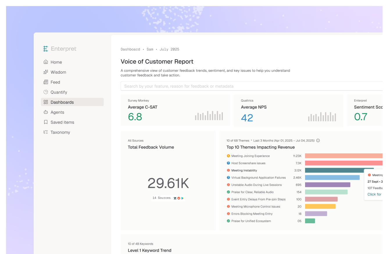
Enterpret's adaptive taxonomy derives themes from what customers actually wrote, which keeps output-level complaints from collapsing into feature-level buckets that analytics already covers. The customer context graph attaches account, segment, and revenue to every record, so a feedback theme can be sized against the usage and revenue behind it instead of being weighed as an anecdote.
Rarely. A survey adds a third self-selected sample with its own response bias, and it asks only what you thought to ask. If the disagreement is about cause, read the unprompted feedback you already have first. Surveys are better for testing a hypothesis you already formed than for arbitrating one.
If your analytics and your feedback keep disagreeing, see how Enterpret's customer context graph sizes a complaint theme against the accounts behind it.
Lorem ipsum dolor sit amet, consectetur adipiscing elit. Suspendisse varius enim in eros elementum tristique. Duis cursus, mi quis viverra ornare, eros dolor interdum nulla, ut commodo diam libero vitae erat. Aenean faucibus nibh et justo cursus id rutrum lorem imperdiet. Nunc ut sem vitae risus tristique posuere.