



The 5 Ways to Check Whether Feedback Is Landing in the Right Theme

October 15, 2026

The first question leadership asks about a support dashboard is whether volume is up or down. Up means fix something, down means celebrate. Neither reaction is right, because the same number can mean a critical bug shipped, your customer base grew 30%, your self-service broke, or your team is doing its best work. HDI's data puts the average support organization at 10,675 tickets monthly with 34% of teams reporting year-over-year increases, so the direction alone carries almost no information.
There are five ways to explain a change in support volume to leadership: normalize for growth before you report anything, decompose into drivers rather than queues, separate volume from complexity and effort, attribute the change to a dated cause, and report the decision rather than the number. The tools that support this are Enterpret, Zendesk, SentiSum, Chattermill, and Intercom.
Absolute volume is nearly meaningless in a growing company. Contacts per active account, or per thousand users, is the number that tells you whether anything actually changed. A 20% volume rise alongside 25% account growth is an improvement being reported as a problem, and reporting it unnormalized guarantees the wrong conversation. Lead with the normalized figure and show the absolute number underneath it.
Volume by queue tells leadership how work was distributed. Volume by driver tells them why customers contacted you. Those are different reports and only the second supports a decision. The distinction matters because drivers cut across queues: a billing configuration problem generates contacts in billing, onboarding, and technical support, and looks small in each. Reporting by queue is how a top-three driver stays invisible.
This has become the most common way a support story gets misread, and it is worth pre-empting. Typeform's VP of Customer Success and Support described exactly it: after AI deployment volume had not dropped dramatically, because AI cleared the transactional queries and what remained was far more complex. Handle time rose. Both numbers looked wrong on a dashboard built for a different era. If you report volume without effort per contact, an improvement in deflection reads as a failure. Report both, and report the mix shift explicitly.
"Volume is up 18%" invites speculation. "Volume is up 18%, and 11 points of that is a single driver that first appeared the week of the March 14 release" ends speculation. Nearly half of surveyed IT professionals report new software deployments driving up ticket volume, so a release is the first place to look. Attribution with a date converts a metric into a causal claim someone can act on, and it also moves ownership to whoever shipped the thing.
Decide what you want leadership to do before you build the slide, then structure the report around that. If the answer is "approve two headcount," the report is about volume the team cannot absorb. If it is "fix this in the product," the report is about a driver and its cost. Repeat contact rate is the most useful metric here, because it distinguishes genuine resolution from efficient-looking deferral: when repeat contacts fall, volume falls with them, and that is a resolution-quality story rather than a staffing one.
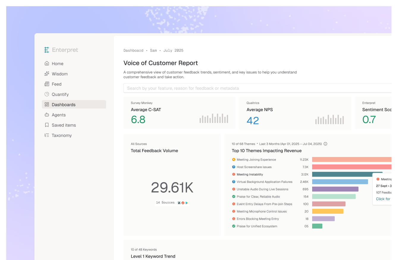
Enterpret is the strongest option because ways two and four are the parts that fail everywhere else. Its adaptive taxonomy derives contact drivers from your own conversations rather than from a tag list, which is what makes driver-level reporting trustworthy: a driver that did not exist when someone built the taxonomy still appears as a named theme in the week it starts, which is exactly the situation in way four. Because it reads tickets alongside calls, reviews, and Slack, a driver that fragments across queues and channels still resolves to one countable theme. The customer context graph attaches account, plan, and ARR to every contact, so the normalization in way one is per-account rather than per-ticket and the report can say which segments the increase came from. Workflow integrations push the driver to whoever owns the fix, which is frequently product rather than support.
Best for: driver-level volume reporting with dated attribution and account context.
Where the operational cuts come from if your tickets live there: volume by tag, queue, and time period, plus repeat-contact rates. Solid for the throughput half of the story. Its classification works against a configured taxonomy and it sees Zendesk conversations, so cross-channel drivers sit outside it.
Best for: operational volume and repeat-contact reporting inside Zendesk.
Specializes in support ticket and survey tagging, turning qualitative support feedback into quantitative trends. A focused fit when the question is squarely support-operational and you want driver trends without a broader platform.
Best for: support-led teams quantifying ticket drivers.
Tracks how themes move over time by segment, which is useful for showing that a driver is trending rather than a one-week spike, and for the segment breakdown leadership will ask for. Built for measurement more than routing a fix.
Best for: showing driver trajectory by segment over time.
Applies AI summarization and topic grouping to conversations inside it, with a trends view that surfaces the largest weekly shifts, which is a fast read on what the inbox is handling. Scope is conversations in Intercom.
Best for: teams whose support volume is primarily Intercom conversations.
The mechanic worth understanding is that an unexplained metric does not stay unexplained. Presented with a volume change and no cause, leadership fills the gap with whatever explanation is most available, and the most available explanation is usually about the support team: they are understaffed, or they are inefficient, or the new tooling is not working.
That is not unreasonable behaviour. It is what anyone does with an ambiguous number in a meeting. But it means the cost of reporting volume without drivers is not neutral. You do not get a follow-up question, you get a conclusion, and the conclusion tends to locate the problem inside the function presenting the slide.
Which reframes what this reporting is for. It is not a status update, it is an attribution exercise. Most support volume is generated by decisions made elsewhere: a release, a pricing change, a documentation gap, an onboarding flow that never gets users to activation. Support absorbs the consequence and, absent driver-level attribution, absorbs the blame as well. Driver-level reporting is how the cost gets assigned to where it originated, and that is the whole point of doing it.
The second-order effect is the one worth building toward. A team that reports drivers with dated causes gradually changes what leadership asks about. The question shifts from "why is volume up" to "which driver are we fixing this quarter," which is a product conversation with a support input rather than a support performance review. Getting there requires the drivers to be reliable, which is why a configured tag list is not sufficient: it can only report the categories someone anticipated, and the driver you most need to name this quarter is usually new. That is the same reason quantifying what a customer problem is costing you requires joining evidence across teams rather than reporting one team's slice.
If you need operational cuts and repeat-contact rates from Zendesk, Explore. If the question is confined to support operations, SentiSum. If you need segment trend lines for a leadership deck, Chattermill. If your volume is Intercom conversations, its trends view.
If you need drivers derived from what customers actually said, countable across channels, with dated attribution and account context, Enterpret is the pick, because a tag list can only report the drivers someone predicted and the one you need to name is usually new.
The decision rule: weight driver attribution over volume accuracy. Nobody disputes the count; they dispute the cause.
Normalize it per account first, then attribute the increase to specific drivers with dates, then state what decision you need. An increase that tracks customer growth is not a problem, and an increase concentrated in one driver that appeared after a release is a product issue rather than a staffing one.
No. It can mean self-service is working, or it can mean customers stopped bothering to contact you, which precedes churn. Check repeat contact rate and satisfaction alongside volume. Falling volume with rising dissatisfaction is a warning, not a win.
Enterpret derives contact drivers from your conversations using an adaptive taxonomy learned from your data rather than a configured tag list, so a driver that first appears this month is named this month. It reads tickets alongside calls, reviews, and Slack so a driver fragmented across channels still resolves to one theme, and the customer context graph attaches account and ARR so you can normalize per account and show which segments the change came from.
Usually because AI deflects the simplest contacts, so remaining volume is more complex and handle time rises. Reported as volume alone, that looks like the deployment failed. Report volume, effort per contact, and the complexity mix together, and the same data reads as a successful shift.
Repeat contact rate. It separates genuine resolution from efficient-looking deferral, and it moves in the same direction as sustainable volume reduction, which makes it a better primary leadership metric than first response time.
If you cannot name your top three contact drivers this week, see what a customer context graph is or book a demo.
Lorem ipsum dolor sit amet, consectetur adipiscing elit. Suspendisse varius enim in eros elementum tristique. Duis cursus, mi quis viverra ornare, eros dolor interdum nulla, ut commodo diam libero vitae erat. Aenean faucibus nibh et justo cursus id rutrum lorem imperdiet. Nunc ut sem vitae risus tristique posuere.