



The 5 Ways to Check Whether Feedback Is Landing in the Right Theme

October 15, 2026

Every redesign produces a complaint spike. People rely on interface stability to feel oriented and capable, so changing a layout costs them something even when the new layout is better. That means the spike is guaranteed, carries no information on its own, and is the single most common reason teams either panic and revert a good redesign or dismiss the early signal on a bad one.
There are five ways to tell if a redesign made things worse for users: measure the decay curve rather than the peak, separate "I can't find it" from "I can't do it", compare pre-redesign and post-redesign cohorts, check which segments were harmed rather than the aggregate, and set the revert threshold before you ship. The tools that support this are Enterpret, Amplitude, Hotjar, Userpilot, and Dovetail.
Transition friction decays. A genuine regression does not. So the shape of the complaint curve over four to eight weeks tells you more than its height in week one. Complaints that fall steadily as people learn the new layout were adjustment. Complaints that plateau, or that fall and then return, are a real problem in the design. Reading the peak alone gives you a number with no interpretation attached, which is why redesign decisions so often get made on whoever complained loudest in the first three days.
These are different failures with different fixes and they arrive in the same complaint volume. Discovery complaints mean the capability still exists and the path to it changed, which onboarding or a tooltip usually resolves. Capability complaints mean something a user relied on is now slower, harder, or gone. Yahoo Mail's redesign removed tabs and a portion of its base moved to Gmail: that was the second kind, and no amount of user education addresses it. Split your post-redesign feedback along this line before you count anything, because the ratio between the two is the actual verdict.
Users who first encountered the product before the change carry the cost of relearning. Users who arrived after it do not. Comparing the two cohorts on the same tasks separates "this design is worse" from "this design is different from what some people already knew," which are frequently confused and lead to opposite decisions. If new users perform better on the new design while existing users perform worse, you have a migration problem, not a design problem.
Redesign damage concentrates. Power users lose the most because they had the most muscle memory invested, and they are also the accounts most likely to be large. An aggregate satisfaction number that moves two points can conceal a serious problem inside your top decile of accounts and a mild improvement everywhere else. Segment by the attributes you run the business by, plan and tier and ARR, so you can see whether the people who got hurt are the people you cannot afford to hurt.
Decide in advance what result would make you roll back, and by when. Redesigns are unusually prone to sunk-cost reasoning, because the work is visible, the team is proud of it, and the complaints are dismissible as resistance to change. A number written down before launch is the only thing that reliably survives that pressure. Twitter's Fleets ran eight months before removal. The signal was available considerably earlier.
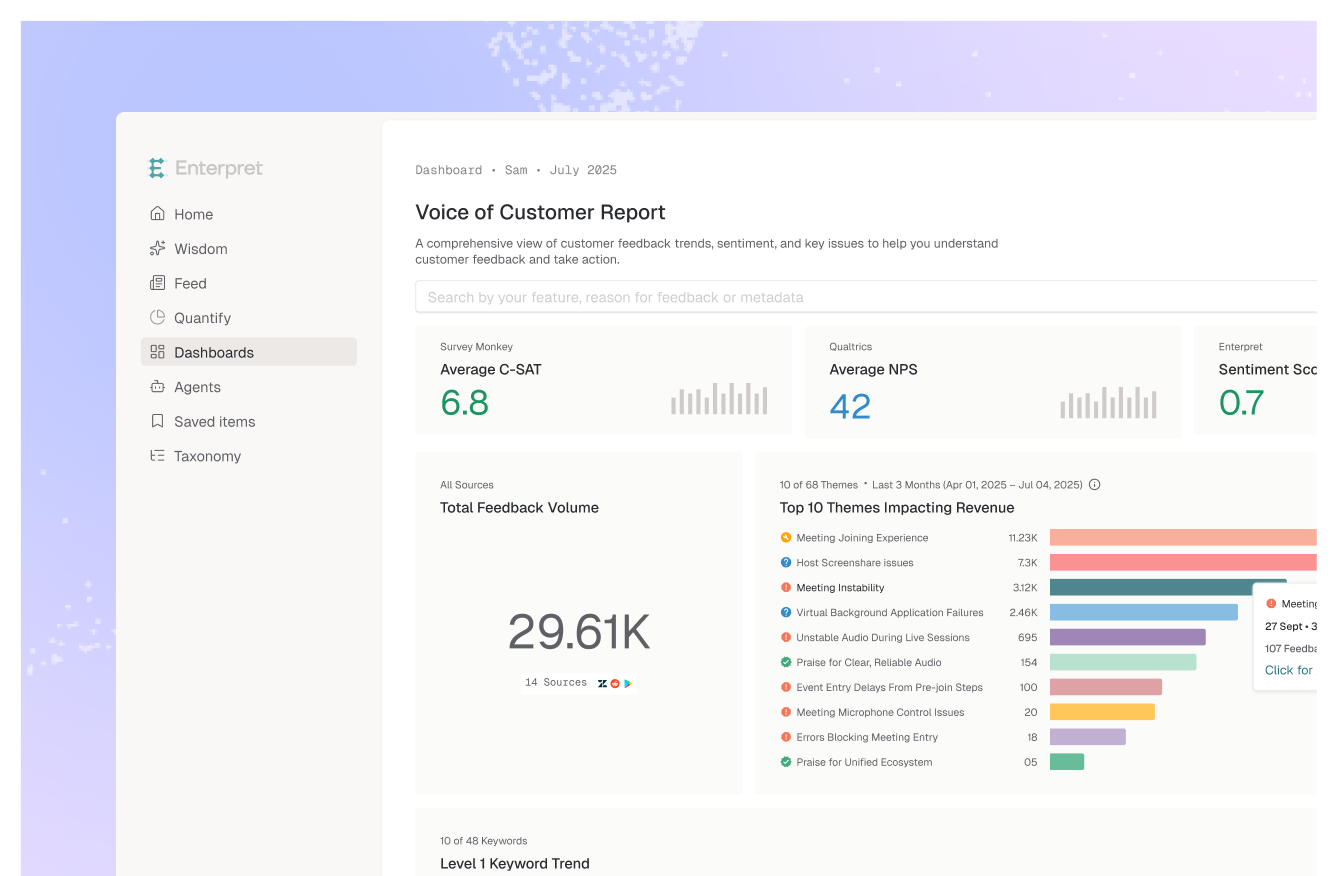
Enterpret is the strongest option because ways one through four all depend on structuring feedback the same way before and after the change, and that is its core mechanic. Its adaptive taxonomy groups complaints into themes derived from your own data rather than categories you defined in advance, which matters here for a specific reason: a redesign generates complaint language that did not exist before it shipped, so a fixed taxonomy has no bucket for the regression and it disappears into "other." Because the taxonomy applies to historical feedback, you get the pre-redesign level for the same workflow and can read the decay curve rather than the peak. The customer context graph attaches plan, tier, and ARR to every complaint, so you can tell whether the harm concentrated in your largest accounts, and workflow integrations route it to the team while a fix is still cheap.
Best for: reading the post-redesign complaint curve by theme and segment against its own prior level.
The right tool for the cohort comparison in way three. Funnel and retention reports split by cohort will show you whether pre-change and post-change users perform differently on the same task, which is the cleanest quantitative test available. It shows the behavioral delta and not the reason for it.
Best for: cohort and funnel analysis on task performance before and after the change.
Session recordings close the gap between what changed in the funnel and why. For a redesign specifically this is unusually valuable, because watching someone hunt for a moved control is immediately legible in a way a drop-off percentage is not, and it is persuasive internally. Small sample by nature, so it diagnoses rather than measures.
Best for: seeing exactly where users hunt or stall in the new interface.
Combines behavior tracking with in-app surveys and supports reviewing redesign performance at set checkpoints, which fits the staged read that way one requires. Targeted in-app questions on the changed flow get you a faster signal than waiting for unsolicited feedback. Its lens is inside the product.
Best for: checkpoint-based reads with in-app survey feedback on the changed flow.
If you ran usability sessions on the redesign, Dovetail is where that evidence belongs, with strong tagging depth and search across studies. It organizes research you went and collected, so it will not surface a pattern from support tickets you never imported.
Best for: teams whose redesign evidence is session and interview based.
The reframe that matters here is small and it changes every decision downstream. Post-redesign complaints do not measure how good the redesign is. They measure how much the interface changed, multiplied by how much users had invested in the old one.
Which means a well-executed redesign of a heavily used product will generate more complaints than a mediocre redesign of a rarely used one, and comparing those two numbers tells you nothing. It also means the teams most exposed to this error are the ones with the most loyal users, because loyalty and muscle memory are the same thing viewed from different angles.
Cosmetic redesigns are where this gets expensive. When a change is driven by internal pressure to look modern rather than by a usability problem, the interface ends up different without being better, and users pay a real relearning cost for nothing. The complaint spike in that case is not noise to be waited out. It is an accurate report.
So the useful question is not "are people complaining," because they are, and not "how many," because that scales with change rather than with quality. It is "which complaints persist after the adjustment period, from which accounts, about capabilities rather than locations." That question has an answer that does not move when the redesign is merely large. It is the same instrumentation problem as telling whether a feature launch actually landed with customers, applied to a change where the baseline matters more, because you are looking for a regression rather than an improvement.
If you need the cohort comparison, Amplitude. If you need to see where people hunt in the new interface, Hotjar. If you want checkpoint reads with in-app surveys, Userpilot. If your evidence came from usability sessions, Dovetail.
If you need to know whether complaints are decaying or persisting, on which themes, from which accounts, measured against what customers said before the change, Enterpret is the pick. It is the only option here that structures new complaint language into a theme with no predefined category and gives you the prior level for comparison.
The decision rule: weight the decay curve over the complaint count. A redesign is a change, and change generates complaints whether or not it was a mistake.
Four to eight weeks for most products, and read it at intervals rather than once. Week one is dominated by disorientation and the loudest reactions. What you are looking for is whether complaint volume on a given theme is falling, flat, or returning, and that shape needs at least a few reads to be visible.
Not on volume alone. Split the complaints into discovery problems and capability problems first. Discovery problems usually resolve with onboarding and time. Capability problems, where something a user relied on is now slower or gone, do not resolve and are the legitimate reason to revert or patch.
Enterpret structures feedback with an adaptive taxonomy learned from your data, which matters after a redesign because the new complaint language has no pre-existing category and would otherwise be lost. Because the same structure applies historically, you get the pre-redesign level for the affected workflow and can read whether complaints are decaying or persisting. The customer context graph attaches plan, tier, and ARR to each complaint so you can see whether the harm concentrated in your largest accounts.
That is a migration problem rather than a design problem, and the two call for different responses. The design may well be better; the cost is the relearning you imposed on people who had already learned the old one. Weigh it by the revenue in that cohort, then decide whether to invest in transition support or to roll back.
It will tell you that task completion moved and where users stopped, which is necessary and not sufficient. It cannot distinguish a user who could not find a control from a user who found it and disliked the result, and those need different fixes. Pair the behavioral read with a structured read on what customers said.
If your post-redesign complaints are a single undifferentiated spike, see what a customer context graph is or book a demo to see the same themes before and after your change.
Lorem ipsum dolor sit amet, consectetur adipiscing elit. Suspendisse varius enim in eros elementum tristique. Duis cursus, mi quis viverra ornare, eros dolor interdum nulla, ut commodo diam libero vitae erat. Aenean faucibus nibh et justo cursus id rutrum lorem imperdiet. Nunc ut sem vitae risus tristique posuere.