



The 6 Fields Every Bug and Feature Request Ticket Needs in 2026

September 14, 2026

Most customer feedback reporting is built to be read, not to be used. It arrives monthly, it opens with a score, it lists the top themes by volume, and it circulates to people who nod at it. Nobody can name a decision it changed. That is not a reporting problem so much as a design problem: the report was scoped around a metric rather than around a decision, so there is no moment at which anyone has to do something differently.
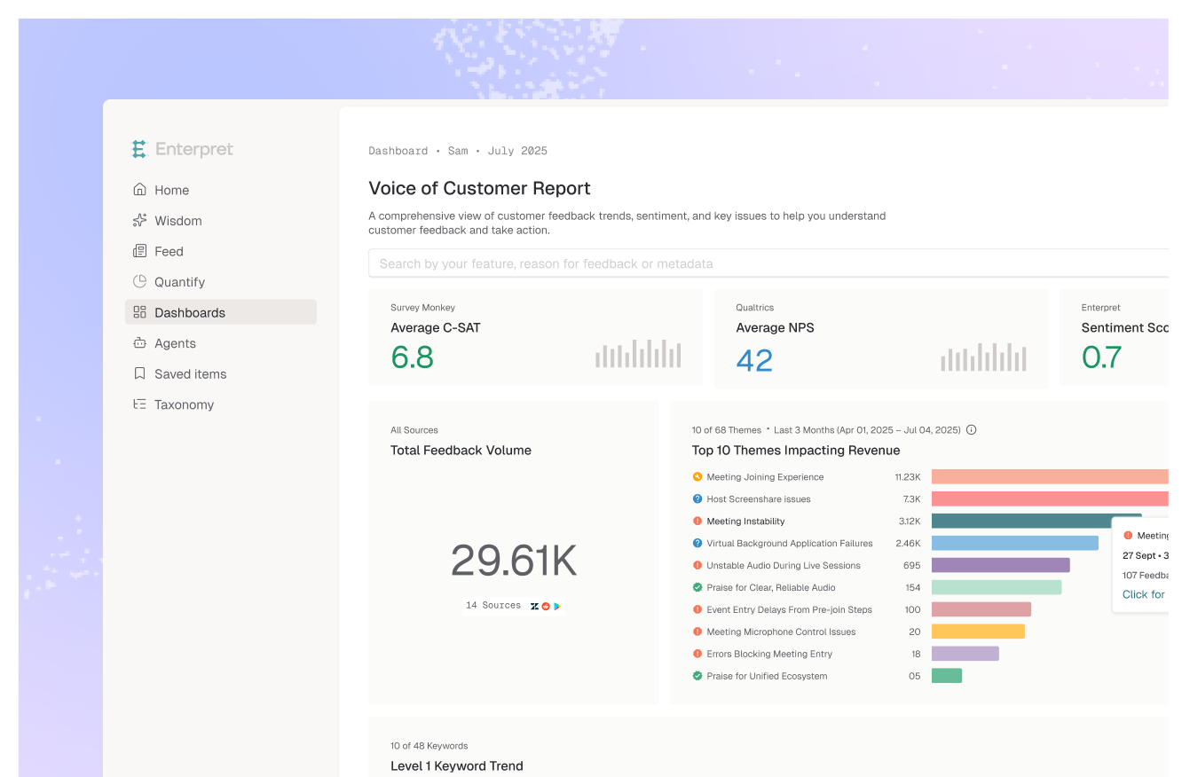
The six customer intelligence reports worth building are the weekly signal digest, the pre-build evidence pack, the release impact readout, the churn post-mortem, the account narrative, and the quarterly theme-to-revenue review. Each one exists to serve a specific decision at a specific cadence, and each has a different reader. That is what separates a customer intelligence report from a voice of customer report: the VoC report describes the state of customer sentiment, and these describe what to do next.
Score any report you produce against these five. If it fails the first, the rest do not matter.
The real differentiator is not presentation quality. It is whether skipping the report would change an outcome.
Reader: product and support leads. Decision: what to look at this week.
One page, delivered into Slack. New and accelerating themes, anything anomalous versus the trailing average, and each item weighted by the accounts behind it. Deliberately excludes stable themes, which is what keeps it short enough to read. The value is latency: it closes the gap between a customer saying something and the team noticing.
Reader: the PM writing the spec. Decision: whether to build it, and what exactly to build.
Assembled per feature candidate rather than on a schedule. Contains the theme, how many accounts it affects, the revenue exposed, the verbatims in the customers' own words, and the adjacent themes that suggest scope. Its job is to replace "sales says customers want this" with a sized, quotable case. This is the report that most often does not exist, and its absence is why roadmaps get argued rather than decided.
Reader: the team that shipped. Decision: is it done, or does it need another pass.
Run two to four weeks after a release. Compares the volume and sentiment of the target theme before and after, and flags any new theme that appeared alongside the fix. Requires a stable category structure, or the comparison is meaningless. It is the cheapest report on this list and the most commonly skipped, which is why so many teams cannot say whether their last quarter of work helped.
Reader: CS and product leadership. Decision: which retention problem to fund next.
Cohort-based rather than account-based, because a single churned account is a story and a cohort is a pattern. Compares feedback from churned accounts against retained ones in the same segment, working back from cancellation through the preceding months. The useful output is the theme that appears early in churned accounts and rarely in retained ones.
Reader: the CSM or AE, before a renewal or QBR. Decision: what to raise, and what to concede.
Per-account, generated on demand. Every piece of feedback from that account across channels, organized by theme, with open items and anything already resolved. It turns a renewal conversation from a defensive exercise into a specific one, and it takes minutes to assemble when feedback is already joined to account records.
Reader: the exec team. Decision: where next quarter's capacity goes.
The only slow report on this list, and appropriately so. Ranks themes by revenue affected rather than mentions, shows quarter-over-quarter movement, and states plainly which of last quarter's investments moved their theme and which did not. That last section is what makes it credible, and it is the section most teams remove.
The pattern is consistent enough to predict. A team builds a monthly feedback report. It is genuinely good: clean charts, accurate themes, a thoughtful summary. It runs for five months. By month six it is being produced but not read, and by month nine it has quietly stopped.
The cause is almost never quality. It is that the report was designed around what could be measured rather than around a decision someone was already making. So reading it is optional, and optional recurring work is the first thing dropped when a quarter gets busy.
The reports above survive because each one is load-bearing for a decision that happens anyway. The PM has to decide what to build. The exec team has to allocate capacity. The CSM has to walk into the renewal. Attach the report to that existing moment and it stops needing a champion. Design it as a standalone artifact and it needs one forever.
Two practical consequences. Build the pre-build evidence pack before the weekly digest, because it is attached to the most consequential recurring decision in the company. And when a report stops being read, do not redesign it. Ask which decision it was supposed to serve, and if there is not a clear answer, retire it. Our guides to presenting VoC data and sharing insights company-wide cover the distribution side, and voice of customer report examples covers the more traditional CX reporting formats.
If you have none of these, build the pre-build evidence pack. It attaches to the highest-stakes recurring decision and it is the one whose absence costs most.
If prioritization is already evidence-based but slow, build the weekly signal digest. If you cannot answer whether last quarter's work helped, build the release impact readout, which is a week of setup. If retention is the pressure, the churn post-mortem. If renewals are the pressure, the account narrative. Build the quarterly theme-to-revenue review last, because it needs the others' structure to be credible.
The rule: one report per decision, and retire any report you cannot attach to one.
A recurring or on-demand artifact that turns feedback across channels into a specific decision input: what to build, what to fix, where capacity goes, what to raise in a renewal. It differs from a voice of customer report mainly in framing. VoC reporting describes the state of customer sentiment, and a customer intelligence report exists to move a decision.
Match the decision, not the calendar. The signal digest is weekly because prioritization is weekly. The release readout runs two to four weeks after a ship. Evidence packs and account narratives are on demand. Only the exec review is quarterly, and it is the one report where a slow cadence is correct.
Feedback from every channel is structured by the adaptive taxonomy, which keeps theme definitions stable across periods so period-over-period comparison is valid, and the customer context graph attaches account, segment, and revenue so themes can be ranked by exposure rather than mention count. Reports and digests route into Slack, Jira, and Linear, so the output arrives where the decision is made rather than in a separate tool.
The number, the method, and the evidence. A theme count that cannot be opened to the underlying customer sentences will be challenged once and bypassed after that. Include a path to the verbatims, and include the misses: reports that only show wins get read as advocacy.
You can build any single one of these in a spreadsheet. The problem is the second month, when the categories from month one need to still mean the same thing. That reproducibility requirement, not the analysis itself, is what makes recurring reporting a tooling question rather than an effort question.
If you are designing reporting that attaches to product decisions rather than describing sentiment, see how Enterpret works for product teams.
Lorem ipsum dolor sit amet, consectetur adipiscing elit. Suspendisse varius enim in eros elementum tristique. Duis cursus, mi quis viverra ornare, eros dolor interdum nulla, ut commodo diam libero vitae erat. Aenean faucibus nibh et justo cursus id rutrum lorem imperdiet. Nunc ut sem vitae risus tristique posuere.