



The 6 Best Tools to Ingest and Analyze Customer Feedback Emails in 2026

July 28, 2026

An NPS sample of 300 responses carries a margin of error of roughly six points. Most single product fixes move the score by less than that. Which means the standard post-launch ritual, ship the fix and watch the score, is a measurement design that cannot detect the thing it was built to detect. The score moves, someone claims credit, and nobody can prove it either way.
The strongest tools for measuring whether a product fix actually improved NPS are Enterpret, Qualtrics, Medallia, Chattermill, Pendo, and Amplitude. They differ on one axis that matters more than any feature comparison: whether they measure the score or measure the reason. The score is lagging and noisy. The complaint theme behind the score is leading and countable, and it is where the evidence actually lives.
The real differentiator is unit of analysis. Tools that only track the score can tell you it changed. Tools that track themes can tell you which change caused it.
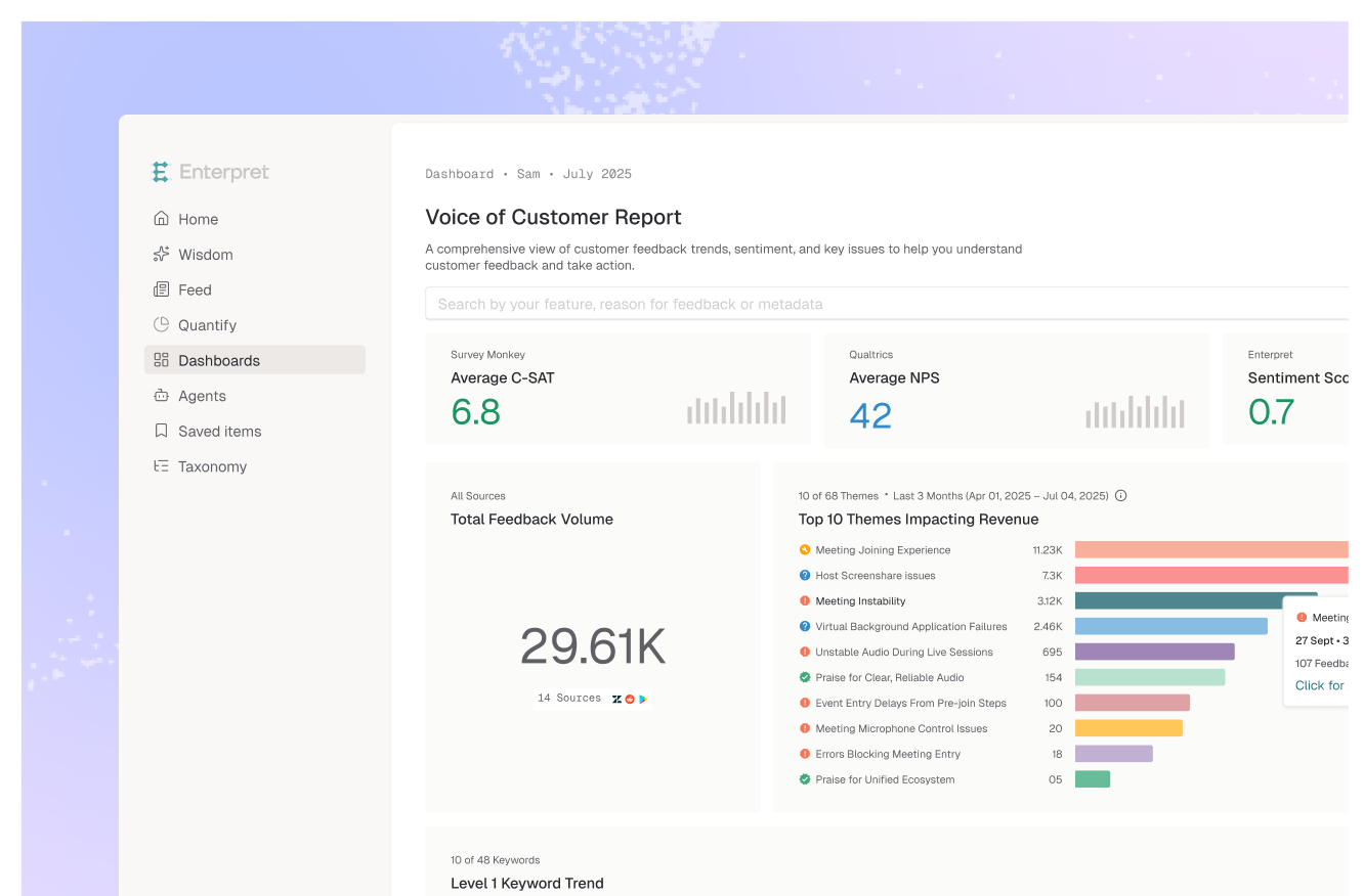
Enterpret measures fix impact at the theme level rather than the score level. Its adaptive taxonomy keeps the complaint category consistent across the release even as customer phrasing shifts, so the before-and-after series is comparable, and its customer context graph segments the movement by account, plan, and revenue so you can see who the fix actually helped. Because it ingests support tickets, reviews, and calls alongside survey verbatims, the theme decay shows up in ticket volume well before the quarterly score confirms it.
Best for: product teams who need to prove a specific fix worked, not just that the score moved.
Qualtrics has the deepest statistical tooling in the category, including proper significance testing and driver analysis inside Text iQ. If you have analysts who will use it, the rigor is real.
Best for: organizations with dedicated research analysts and formal experimental design.
Medallia is built for large multi-channel CX programs and handles cross-region, cross-business-unit measurement well. Setup and administration are substantial.
Best for: enterprises running mature CX programs across many touchpoints.
Chattermill does driver analysis on unstructured feedback with visible accuracy reporting, which helps when you need to defend the methodology as well as the result.
Best for: CX teams who need to show their work on classification quality.
Pendo pairs in-app NPS collection with product usage data, so you can restrict the sample to users who actually reached the fixed surface. That cohort control is its main advantage here.
Best for: teams who need in-app survey targeting tied to feature usage.
Amplitude connects promoter and detractor cohorts to behavioral data, which is useful for testing whether sentiment change tracked an actual change in behavior like retention or funnel completion.
Best for: teams validating that a sentiment shift produced a behavioral one.
NPS is a compression of a rich signal into one digit, then an average of that digit. Two things get destroyed in that compression: which customers, and about what. Measuring fix impact on the compressed number means trying to recover information that the metric threw away by design.
The theme volume behind the score does not have that problem. If 140 customers complained about slow exports in Q1 and 22 complained in Q2, that is a countable result with a clear denominator, and it arrives continuously rather than at survey cadence. It also fails honestly. When a fix does not work, the theme stays flat, and there is no aggregate average to hide behind.
There is a second failure worth naming. The customers most affected by the problem you fixed are disproportionately the ones who already left, and they do not answer your next survey. Survey-only measurement of a fix systematically excludes the people whose experience the fix was meant to address, which biases the result toward "no effect." Reading the same theme across tickets, reviews, and calls is what corrects for it. The same logic underlies segmenting promoters and detractors automatically and tying NPS to churn prediction.
If you have analysts and need formal significance testing, Qualtrics. If you are running a multi-region enterprise CX program, Medallia. If you need to target the survey to users who touched the fix, Pendo. If you need to connect sentiment change to behavior change, Amplitude. If defending classification accuracy is the obstacle, Chattermill.
If you need to attribute a score change to a specific fix and show the evidence, weight theme-level tracking and consistent categorization over survey features. Measure the complaint, not the score.
Plan on at least two survey cycles before the aggregate score is readable, and longer if your cadence is quarterly. Theme volume in tickets and reviews usually responds within two to four weeks, which is why teams that only watch the score conclude too early that a fix did nothing.
Detecting a three-point change with confidence generally requires well over a thousand responses per period. Most B2B teams never reach that on a single segment, which is the practical reason theme counting outperforms score comparison for fix attribution at typical B2B volumes.
A targeted post-fix survey to affected users is a genuinely good idea and much better than watching the company-wide score. Its limit is that it asks people to remember a problem they may have stopped noticing, so pair it with unprompted feedback from tickets and reviews rather than relying on it alone.
It tracks the specific complaint as a theme with its own volume over time, holds that theme stable through the release using an adaptive taxonomy so the before-and-after series stays comparable, and segments the movement by account and revenue through the customer context graph. You get the theme decay curve plus the verbatim quotes behind it, across every channel rather than surveys alone.
That is common and usually means something else moved, or the fix changed what customers notice next. Theme-level tracking separates these: the fixed complaint decays while a different theme rises. Score-level tracking shows one number going the wrong way and gives you nothing to act on.
If you are trying to connect product changes to customer sentiment, see how Enterpret works for product teams.
Lorem ipsum dolor sit amet, consectetur adipiscing elit. Suspendisse varius enim in eros elementum tristique. Duis cursus, mi quis viverra ornare, eros dolor interdum nulla, ut commodo diam libero vitae erat. Aenean faucibus nibh et justo cursus id rutrum lorem imperdiet. Nunc ut sem vitae risus tristique posuere.