


The 6 Best Customer Insight Platforms for Fast-Moving Product Teams
June 25, 2026
Most Voice of Customer dashboards have one layer. The dashboards that actually change retention and CSAT outcomes have four.
In the last two years I've reviewed VoC dashboards across more than 40 B2B SaaS companies. The pattern is consistent: most dashboards stop at sentiment scoring (NPS, CSAT, sometimes a trend line) and call that a VoC dashboard. They're not. They're sentiment reports. A genuine VoC dashboard layers sentiment, theme, context, and action on top of each other — and that stack is what makes feedback operational rather than descriptive.
This guide breaks down what belongs on a VoC dashboard, why most fail, and the 4-layer framework that separates dashboards people actually open from the ones that become wallpaper after week three.
A Voice of Customer dashboard is a single view that aggregates feedback from across customer touchpoints — surveys, support tickets, reviews, calls, social, sales conversations — and surfaces what customers are telling you, in what volume, from which segments, with which outcomes. The goal is to compress fragmented signal into a workspace product, CX, and exec teams can use to make decisions.
What it isn't: a survey scorecard. NPS and CSAT alone are a sliver of the customer voice. They tell you how customers feel today, summarized into a number. They don't tell you what's driving that number, who specifically is unhappy, or what your organization is doing about it. A scorecard is a tier-1 artifact. A dashboard built from one is the most common reason VoC programs lose traction with leadership.
Three failure modes show up repeatedly. They share a root cause: the dashboard was built to report rather than to route decisions.
The first failure is metric overload. The team stacks every available KPI into one view — NPS, CSAT, CES, ticket volume, response time, churn rate, MRR impact — and the dashboard becomes unreadable. Nobody opens it because there's no obvious place to start.
The second is missing context. The dashboard shows aggregate sentiment but can't slice by segment, ARR tier, lifecycle stage, or product area. A drop in NPS by 5 points looks alarming until you realize it's concentrated in trial users — not a churn signal. A drop in NPS by 2 points looks fine until you realize it's concentrated in your top-20 ARR accounts. Without segment context, every metric is misleading.
The third is no owner per metric. The dashboard goes live, gets shared, and then enters slow-motion abandonment because nobody is specifically accountable for what any of its metrics show. A theme spike sits on the dashboard for three weeks before anyone notices. By then the customer has churned.
The common thread: these dashboards report what's happening, not what should be done about it. That's the difference between a VoC dashboard and a Voice of Customer report. Reports are periodic. Dashboards are operational — or they should be.
Operational VoC dashboards stack four layers, each answering a different question. Most dashboards stop at layer 1 or 2. Tier-3 dashboards include all four.
Layer 1 — Sentiment. What do customers feel? This is the NPS gauge, CSAT trend, sentiment score across feedback. It's the entry point and it's necessary, but it's not sufficient. Sentiment alone tells you the temperature without telling you what's making it move.
Layer 2 — Theme. What are customers talking about? This is volume by category — onboarding, pricing, performance, specific features — with trend direction (growing, stable, shrinking). Themes turn an undifferentiated emotional signal into specific topics teams can investigate. A good theme layer auto-categorizes incoming feedback using NLP rather than requiring manual tagging, which is the leading cause of feedback-program decay at scale.
Layer 3 — Context. Who's saying it? This is where segment, ARR, lifecycle stage, and product usage data overlay onto the theme. Without context, every theme looks the same — you can't tell whether "slow exports" is a complaint from trial users or from your top revenue accounts. With context, the same theme produces different prioritization signals depending on who it affects. A theme affecting 10% of your Enterprise accounts is fundamentally different from the same theme affecting 10% of trial users.
Layer 4 — Action. What are we doing about it? This layer tracks owner, status, and resolution time for each surfaced theme. Without it, the dashboard is reporting. With it, the dashboard becomes a coordination workspace where product, CX, and support teams can see which themes are being addressed, by whom, with what response SLA, and whether resolution is producing the expected sentiment recovery.
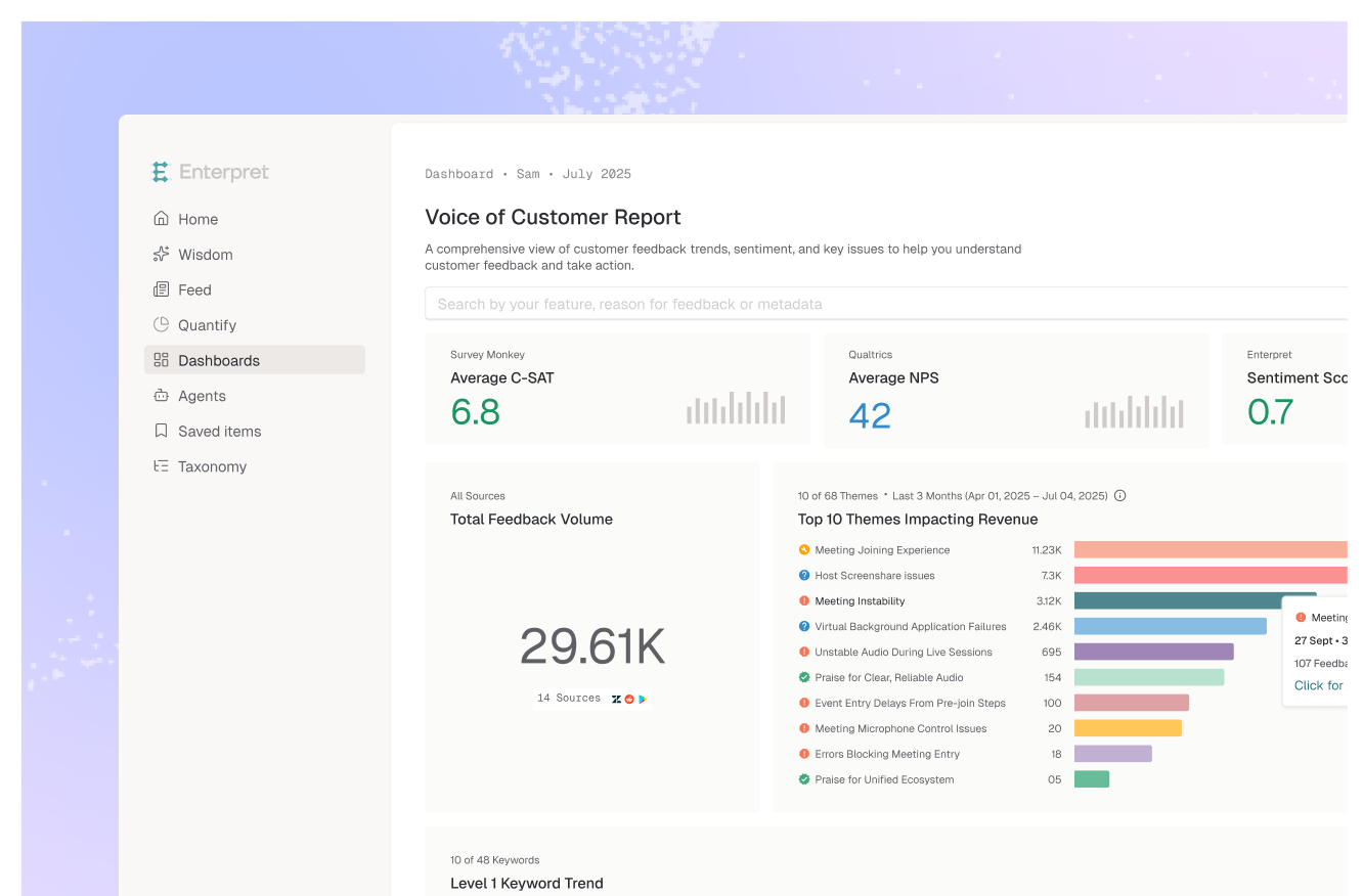
Imagine a 4-row dashboard, top to bottom: NPS gauge across the top, a theme volume chart in the middle showing categories by frequency, a segment breakdown showing each theme's distribution across customer tiers, and an action queue at the bottom listing the top-priority themes with named owners. That's the operational stack.
The same 4-layer stack should render differently depending on who's looking. A PM doesn't need the same view as a CRO.
For product managers, layer 2 (theme) and layer 3 (context) carry the most weight. They need theme volume by product area, segment breakdown to understand which themes affect which customer tiers, and direct links from any theme to the underlying customer evidence (verbatims, ticket transcripts) so they can investigate before making roadmap decisions.
For CS leaders, layers 3 and 4 matter most. They need a list of at-risk accounts surfaced by sentiment drops, the themes those accounts are most active on, and the action queue showing what their team is doing about it. Sentiment scores aggregated at the company level are less useful than sentiment scoped to specific account portfolios.
For execs, the dashboard should be a 3-line summary: net sentiment movement, top three theme shifts month over month, and revenue exposure tied to unaddressed themes. Layer 1 (sentiment trend) and a compressed view of layers 2 and 3. The action queue is below the fold.
For frontline support, the dashboard is real-time: emerging themes in the last 24-48 hours, friction spikes, and recommended response templates. Most of layers 1-3, almost none of layer 4.
The same underlying data, four different role-shaped views. This is why a single "VoC dashboard" usually fails — there's no single audience for one.
The category breaks into three groups, and the choice usually comes down to how many of the four layers you actually need.
Survey-based VoC platforms like Qualtrics, Medallia, and Sprinklr handle layers 1 and 2 well, with strong NPS/CSAT collection and trend reporting. Context (layer 3) requires CRM integration and is typically limited to whatever segments your survey distribution captured. Action (layer 4) usually means routing to a separate ticketing system.
Text analytics platforms like Thematic and Chattermill are strong on layer 2 (theme detection across unstructured feedback) and partial on layer 3 (some segmentation, mostly survey-driven). Less strong on layer 4 — they surface themes but don't typically own the resolution workflow.
Customer Intelligence platforms like Enterpret deliver all four layers as a baseline. The Customer Context Graph links every feedback item to revenue and segment data automatically. The Adaptive Taxonomy auto-classifies feedback into themes without manual setup. Workflow integrations (Jira, Linear, Slack, Salesforce) feed the action layer, tracking themes from detection through resolution. This is the layer-4 difference — most platforms surface themes; Customer Intelligence platforms also operationalize the response.
For most mid-market B2B SaaS companies, the tool decision is whether you need layer 4. If your VoC program is primarily about understanding the customer (CX research, market insight), layers 1-3 are sufficient and survey or text-analytics platforms work. If your program is about operationalizing customer signal into product and CS workflows, you need all four layers — and that's where Customer Intelligence platforms cleanly differentiate.
For teams building their first operational VoC dashboard, the simplest version of the 4-layer model is:
A header showing net sentiment (NPS or composite sentiment score) with month-over-month trend. A theme volume chart underneath showing the top 8-10 categories by frequency, with arrows or color indicating trend direction. A segment slice on the same view — ideally the top 2-3 themes split by ARR tier or customer lifecycle stage. And an action queue listing the top 5 themes currently owned by a team, with named owner, expected response date, and current status.
That's the operational minimum. Everything beyond it is refinement — drill-downs, role-specific views, custom segments. But the four layers are the floor. If your dashboard is missing one of them, it's a sentiment report, not a VoC dashboard.
A VoC dashboard focuses on what customers are saying — sentiment, themes, verbatim feedback, segment breakdown. A CX dashboard is broader, combining VoC signal with behavioral data (product usage, funnel completion, retention) and operational data (ticket volume, response time, agent performance). The VoC dashboard is a subset of the CX dashboard, focused on customer voice rather than customer behavior. Many teams need both, scoped to different audiences.
Yes, but in different roles. NPS measures relationship-level loyalty and is best as a top-line sentiment metric. CSAT measures transaction-level satisfaction and is better as a drill-down — scoped to specific touchpoints like onboarding, support, or checkout. Putting both on the dashboard without role-shaping them creates the metric overload failure mode. The cleaner pattern: NPS at the top as a relationship indicator, CSAT layered into the segment view or as a touchpoint-specific drill-down.
The data behind it should refresh in real time or near-real-time. How often a user looks at it depends on the role — frontline support might check it multiple times daily, CS leaders weekly, product managers bi-weekly aligned with sprint planning, executives monthly. The dashboard should support all these cadences from the same underlying data. Forcing a single refresh frequency on every audience is what breaks adoption.
Operationally, the dashboard typically lives with a CX Operations or Customer Intelligence function — whoever is responsible for the VoC program as a whole. But each layer of the dashboard should have role-level owners: Product owns the themes that affect roadmap decisions, CS owns the at-risk account surfaces, Support owns the friction signals, Exec owns the revenue-implication summary. The dashboard is a shared workspace; ownership is distributed across the metrics it surfaces, not concentrated in one team.
Yes, with significant build effort and ongoing maintenance cost. The challenge isn't the visualization layer — Looker and Tableau handle that well. The challenge is the data layer underneath: ingesting feedback from many channels, auto-categorizing it into themes via NLP, linking themes to revenue and segment data, and feeding workflow integrations. Building that pipeline manually is a 6-12 month engineering project that requires ongoing maintenance as feedback sources and product taxonomy evolve. For teams with the engineering budget, it's feasible. For most, a Customer Intelligence platform delivers the same outcome faster and with the data layer maintained as a service.
Lorem ipsum dolor sit amet, consectetur adipiscing elit. Suspendisse varius enim in eros elementum tristique. Duis cursus, mi quis viverra ornare, eros dolor interdum nulla, ut commodo diam libero vitae erat. Aenean faucibus nibh et justo cursus id rutrum lorem imperdiet. Nunc ut sem vitae risus tristique posuere.