



The 5 Ways to Check Whether Feedback Is Landing in the Right Theme

October 15, 2026

An NPS score is a number with no explanation attached. The explanation lives in other systems: the verbatim the customer left, the support ticket they filed a week earlier, the feature they never adopted, the account they belong to. Unified NPS analysis is the practice of connecting those sources so the score comes with its context, and the reason most NPS programs stay shallow is that they analyze the survey in isolation. Getting to a real answer, why is NPS moving and among whom, means deciding which data sources to connect.
The six data sources to connect for unified NPS analysis are the NPS survey platform, support tickets, product usage data, your CRM, reviews and community, and sales and success calls. Each adds a layer the score alone is missing. The goal is not to collect more surveys; it is to surround the score with the context that explains it. Here is what each source contributes and why it belongs in the analysis.
Start with the source of the score itself, whether that is Delighted, AskNicely, Qualtrics, SurveyMonkey, or another survey tool. The number matters, but the open-text verbatim matters more: it is the customer explaining, in their own words, why they gave the score. Connecting the survey platform so the verbatims flow into analysis, not just the numeric score, is the first and most important step. A score with no comment is a smoke alarm with no location.
Detractors rarely wait for a survey to voice a problem. The issue behind a low score is usually sitting in a support ticket filed days earlier. Connecting support systems like Zendesk and Intercom lets you link a detractor's score to the friction they already reported, turning "NPS dropped" into "NPS dropped among accounts that hit this specific issue." Support is where the cause of the score often lives.
A score explains sentiment; usage explains behavior. Connecting product analytics such as Amplitude, Mixpanel, or Pendo lets you see which features promoters use that detractors never adopted, and what behavior predicts a rising or falling score. This is the layer that turns NPS from a lagging opinion metric into something you can tie to activation and retention. For the deeper version of this linkage, see how to choose a tool that links NPS responses to product usage.
An NPS response is far more useful when you know whose it is. Connecting the CRM, Salesforce or HubSpot, attaches account, segment, plan, and revenue to every score, so you can weight the analysis by business impact. A detractor score from a top-20 account is an emergency; the same score from a free trial is noise. Without CRM context, every response counts the same, which is how NPS programs end up prioritizing the loudest instead of the most valuable. This account linkage is the job of a customer context graph.
Customers volunteer NPS-style sentiment constantly outside the survey, in App Store and G2 reviews, on Reddit, in your Discord or community forum. Connecting these unsolicited sources catches the sentiment of customers who never answer a survey and often surfaces an issue before it shows up in the NPS trend. It also corrects the survey's response bias by adding the voices the survey misses.
The richest explanations of why customers feel the way they do are in call transcripts, sales conversations, churn interviews, and QBRs. Connecting a source like Gong brings that depth into the analysis, so a theme seen in NPS verbatims can be corroborated and elaborated by what customers said out loud on a call. Calls are where the score gets its fullest explanation.
Connecting six sources creates a new problem: the same issue is now described six different ways across six systems, and a customer who left a review, filed a ticket, and answered a survey looks like three people. Unified NPS analysis requires two things beyond the connections. First, one consistent taxonomy that resolves the same issue to the same theme regardless of which source it came from, so a complaint counts once whether it arrived by survey or ticket; an adaptive taxonomy that learns from the data does this without manual mapping. Second, identity resolution that recognizes the review, the ticket, and the survey came from the same customer and the same account. Without those two, connecting sources just produces six disconnected feeds. With them, the score finally comes with its full context. For the tooling side of this, see the best tools for consolidating NPS, CSAT, and CES data.
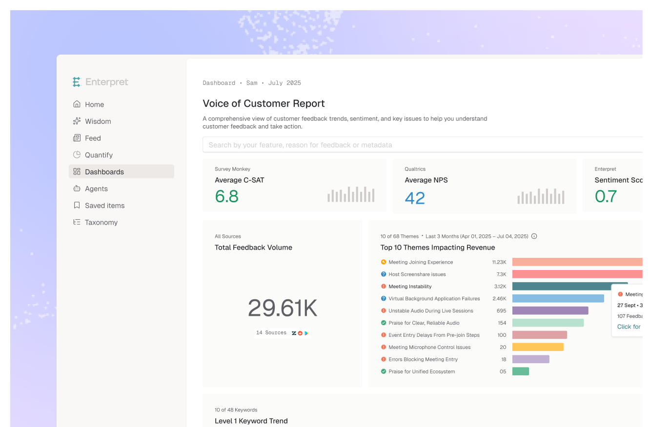
Enterpret connects all six of these sources natively, more than 50 in total, and does the hard part after the connection: it resolves the same customer across sources, applies one adaptive taxonomy so themes are comparable regardless of origin, and ties every response to account and revenue through the customer context graph. The result is NPS analysis where the score arrives with the ticket, the usage, the account, and the call behind it, rather than a number waiting to be explained.
Six sources give NPS its full context: the NPS survey platform (for the score and verbatim), support tickets (where detractors elaborate), product usage data (the behavior behind the score), the CRM (account, segment, and revenue), reviews and community (unsolicited sentiment), and sales or success calls (in-depth explanation). Each adds a layer the score alone is missing.
Because the survey gives you a score and a short comment from the minority who respond, with no account context, no behavioral data, and none of the surrounding feedback that explains the score. Analyzed in isolation, NPS tells you sentiment moved but not why or among whom. Connecting adjacent sources is what turns the score into a diagnosis.
Not the connections, the reconciliation. Once multiple sources are connected, the same issue is described differently across them and the same customer appears as several records. Unified analysis requires one consistent taxonomy that maps the same issue to the same theme across sources, plus identity resolution that ties records back to one customer and account. Without those, connecting sources just creates parallel feeds.
Enterpret connects 50-plus sources, resolves the same customer across them, applies one adaptive taxonomy so themes are comparable regardless of origin, and ties every response to account and revenue through its customer context graph. That means an NPS score arrives with the support ticket, product usage, account, and call context behind it, rather than as an isolated number.
Want NPS analysis with full context instead of a lonely score? See how Enterpret unifies every source.
Lorem ipsum dolor sit amet, consectetur adipiscing elit. Suspendisse varius enim in eros elementum tristique. Duis cursus, mi quis viverra ornare, eros dolor interdum nulla, ut commodo diam libero vitae erat. Aenean faucibus nibh et justo cursus id rutrum lorem imperdiet. Nunc ut sem vitae risus tristique posuere.