



The 6 Differences Between Voice of Customer Software and Customer Intelligence

September 15, 2026

Most content that ranks for "customer service scorecard" is describing a QA rubric: tone, empathy, grammar, scored per conversation on a weighted scale. That is a real artifact and it answers a real question. It is not a team scorecard, and confusing the two is why support leaders end up with a spreadsheet full of quality scores and no idea why volume went up 18%.
A support team scorecard needs eight metrics: contact volume against a normalizing base, contacts by driver, CSAT with its response rate, response and resolution time by channel, escalation rate and composition, repeat contact rate, avoidable contact volume, and the revenue exposure sitting in the queue. The first six are available in any help desk. The last two are where most scorecards stop and where the useful part starts.
The distinction is operational. A QA rubric answers "how well did this agent handle this ticket." A team scorecard answers "is the queue getting better or worse, and why." Both matter. Only one of them tells you whether to hire, to fix a doc, or to file a product bug.
The failure mode is predictable: a team runs a rigorous QA program, agent scores climb, and contact volume climbs with them. Nothing on the rubric could have caught that, because the rubric never asks what customers were contacting about.
Raw ticket count is close to meaningless on its own, because it moves with customer growth. Normalize: contacts per 100 active accounts, or per 1,000 monthly actives, whichever matches your business. Report both the raw and the normalized number. When they diverge, that divergence is the story.
The breakdown of what customers actually contacted about, ranked, with period-over-period change. This is the single most valuable row on the scorecard and the one most teams do not have, because it requires text categorization rather than a dropdown the agent picks after the fact. Agent-selected reason codes are systematically wrong: they are chosen at close time, under handle-time pressure, from a list designed two years ago.
CSAT without the response rate attached is not a number you can act on. A 4.6 on an 8% response rate and a 4.6 on a 40% response rate describe different realities. Report both, and report the distribution rather than only the mean, because CSAT is usually bimodal and the average hides the tail that actually churns. See going beyond CSAT scores to understand customer sentiment.
Blending chat and email into one average produces a number that describes neither. Split by channel, and report the 90th percentile alongside the median. The median tells you about the normal case. The tail is where the escalations come from.
The rate is table stakes. The composition is the insight: which drivers escalate disproportionately. A driver that is 4% of volume and 30% of escalations is a product problem wearing a support costume.
The percentage of customers who came back about the same issue within a window, and the percentage of tickets reopened after being marked solved. These are the metrics that catch teams gaming handle time. A queue can look fast and be failing if the same customer returns three times.
The share of contacts that had a published answer the customer did not find, or that were caused by a known unfixed defect. This converts support volume into a work item for other teams rather than a headcount request for yours. See finding help center content gaps from support data and turning support tickets into product insights.
Total ARR represented by open tickets, and by escalations specifically, with the largest accounts named. This is the row that changes what the scorecard is for. A support scorecard with an ARR column stops being an operations report and becomes a business one, and it is the version that gets read outside the support org.
This is the 2026 problem and most scorecard templates predate it. When an AI agent handles a share of the queue, every metric above becomes ambiguous unless you separate bot-handled from human-handled conversations.
Handle time drops, because the bot closed the easy ones. CSAT moves in whichever direction depends entirely on the deflection threshold. Contact volume falls while the underlying demand does not, because a bot conversation that ended without resolution often does not create a ticket at all. Escalation rate rises, because what reaches a human is now pre-filtered to be hard.
Report three columns: bot-only, human-only, and handed off. A scorecard that reports a single blended CSAT in a partially automated queue is not measuring your team, it is measuring your deflection rate, and the two will diverge. See measuring AI support agent performance independently and why AI support agents escalate to humans.
Start with metrics one through five. Those come out of any help desk and they give you a defensible weekly read. Add six and seven when you want to argue for engineering time. Add eight when you want the scorecard read by someone outside support.
Keep per-agent rankings off by default. Individual performance belongs in a QA rubric and a 1:1, not on a team scorecard where small samples turn into public conclusions. When you do report individual numbers, flag the sample size next to every one. See QA support tickets at scale with risk weighting and CSAT tools for support QA and agent coaching for the individual layer.
The decision rule: if a metric cannot change a staffing, content, or product decision, cut it from the scorecard.
A QA scorecard evaluates individual conversations against a rubric of quality categories such as tone, accuracy, and resolution, usually to coach agents. A support team scorecard measures the health of the queue over a period: volume, drivers, satisfaction, speed, escalations, and cost. They use different data and answer different questions.
Normalized contact volume, contacts by driver, CSAT with response rate, first response and resolution time by channel, escalation rate and composition, repeat contact and reopen rate, avoidable contact volume, and revenue exposure in the queue.
Weekly for the operational metrics and monthly for the driver and revenue analysis. Weekly is fast enough to catch a spike; monthly is the right horizon for arguing that a driver deserves engineering time, because driver volume is noisy week to week.
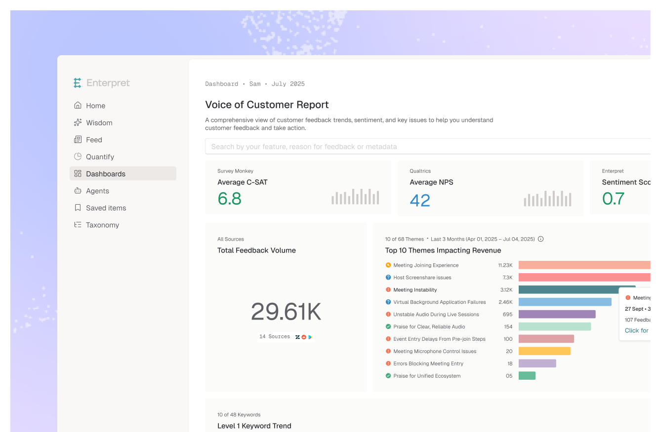
Enterpret categorizes ticket and conversation text with an adaptive taxonomy, which produces the contacts-by-driver breakdown without anyone maintaining a tag list or trusting agent-selected reason codes. The customer context graph attaches account, segment, and revenue to each contact, which is what makes the revenue exposure and avoidable contact rows possible. The scorecard can run on a schedule and deliver to Slack or email.
Only with sample sizes attached, and ideally in a separate view. Weekly per-agent volumes are usually too small to support performance conclusions, and publishing them on a team scorecard turns normal variance into a ranking. Coaching belongs in a rubric and a 1:1.
If your scorecard is missing the driver and revenue rows, see how Enterpret handles customer experience analytics.
Lorem ipsum dolor sit amet, consectetur adipiscing elit. Suspendisse varius enim in eros elementum tristique. Duis cursus, mi quis viverra ornare, eros dolor interdum nulla, ut commodo diam libero vitae erat. Aenean faucibus nibh et justo cursus id rutrum lorem imperdiet. Nunc ut sem vitae risus tristique posuere.